2013
2014
2015
2016
2017
2018
2019
2020
2021
2022
BA Integrated Media & Communication
MA Digital Business Management
<< Scroll >>
Click on the timeline bars to explore my portfolio!
BACHELOR: FOCUS ON UX & MARKETING
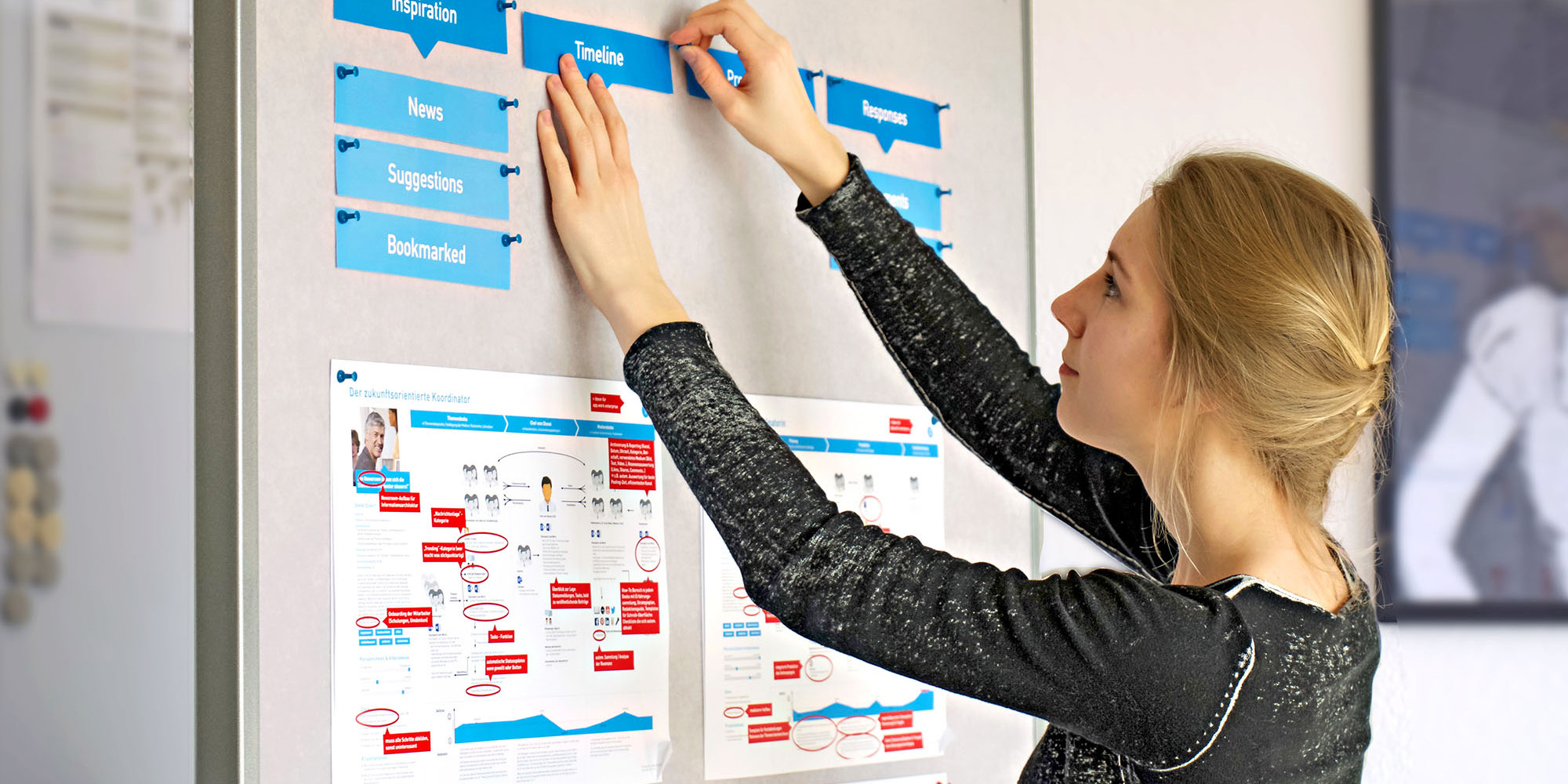
My trainee employer, media consulting hannover, developed an enterprise content management system for people working in corporate communications, so they can plan and produce content collaboratively. During my first of four graded trainee semester projects (14 weeks), I was responsible for the user experience (UX) research.
1) Problem and Research: Interviews
The problem in communication departments was the decentralized system, which was complicated but familiar to users. To help them accept a new system, it needed to be intuitive – based on their current requirements.
GOAL #1:
Learn about current workflow in different companies
GOAL #2:
Learn about the organization of communication departments
GOAL #3:
Learn about the involved user groups and their mental models
The best way to learn about the complicated processes is a conversational method, so I conducted nine phone/skype interviews, each 30-45 minutes. All interviewees were from different medium-sized to big companies and worked in different areas (Editor in Chief, Copywriter, Social Media Manager…).
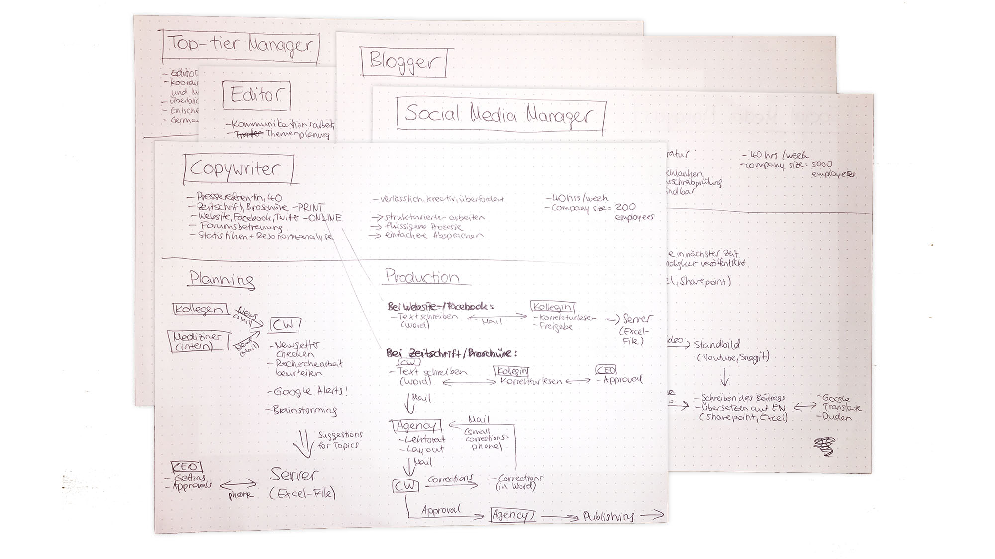
2) Personas and User Experience Maps
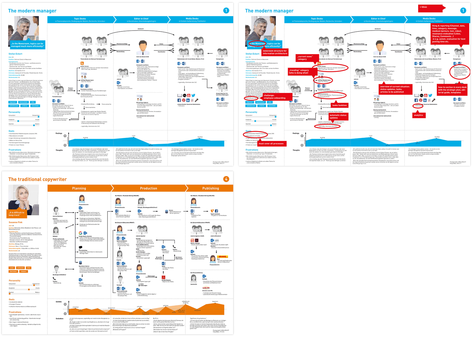
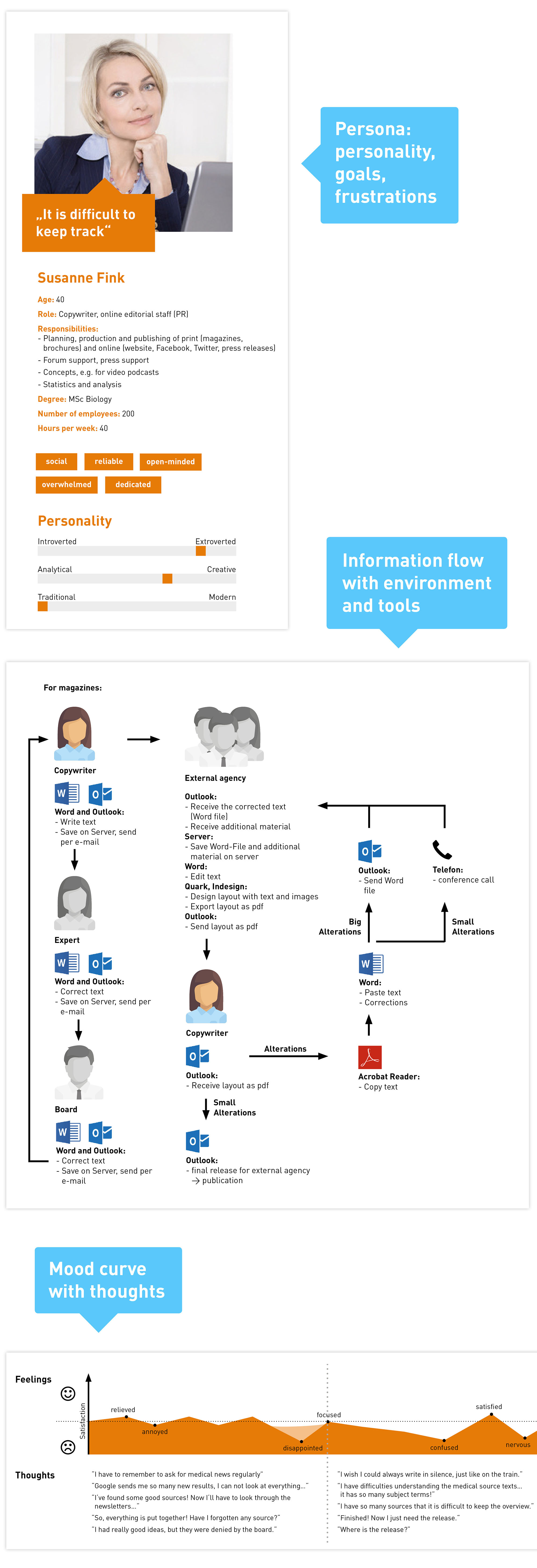
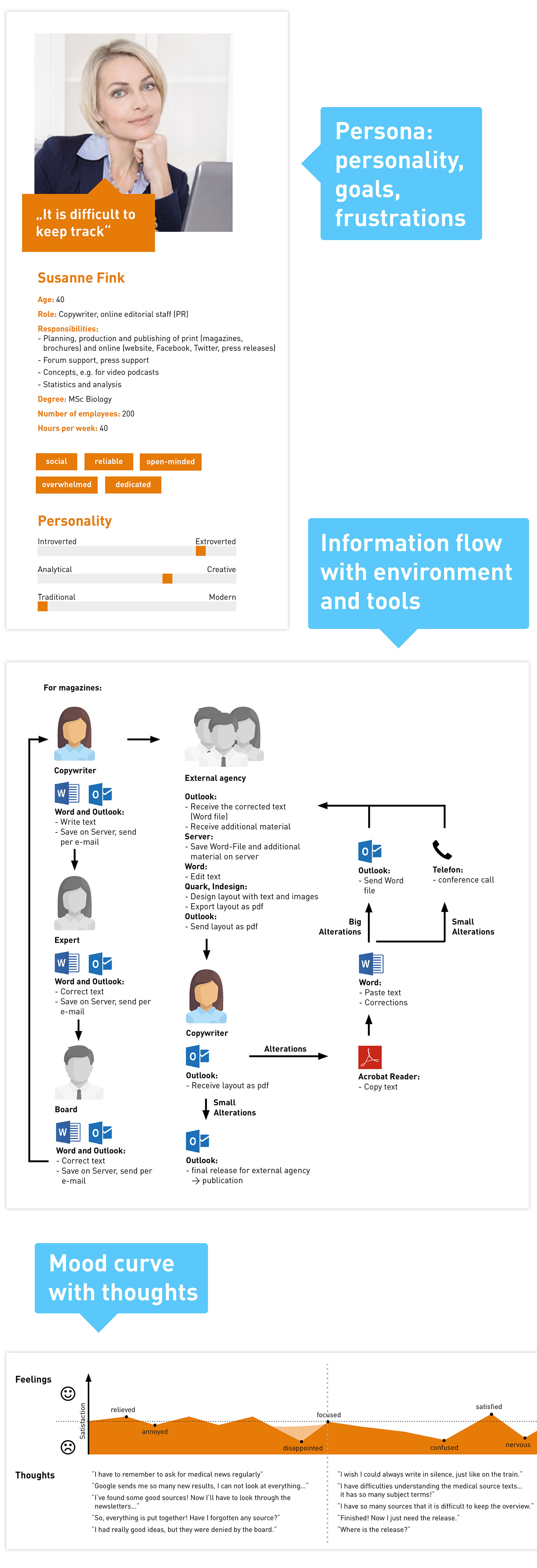
In my interview notes, I identified five archetypes, so I created five personas showing characteristics, information flow with environment and tools and the mood curve. Finally, I highlighted requirements and ideas for the software functions.
3) Results and New Information Architecture
RESULT #1:
The
workflow in communications consists of four parts that need to be simplified:
- Searching for interesting topics in many sources Searching for interesting topics with a content curation tool
- Planning topics with spreadsheets Planning topics with content management system
- Writing and release process via e-mail Writing and release process in a file hosting system
- Publishing content and measuring success manually Publishing content and measuring success automatically
RESULT #2:
There are
two different organization structures for this workflow:
- Traditional structure: widely used, but medium effectivity and efficiency
- Newsroom structure: high effectivity and efficiency, but modest usage
RESULT #3:
Both organization structures involve
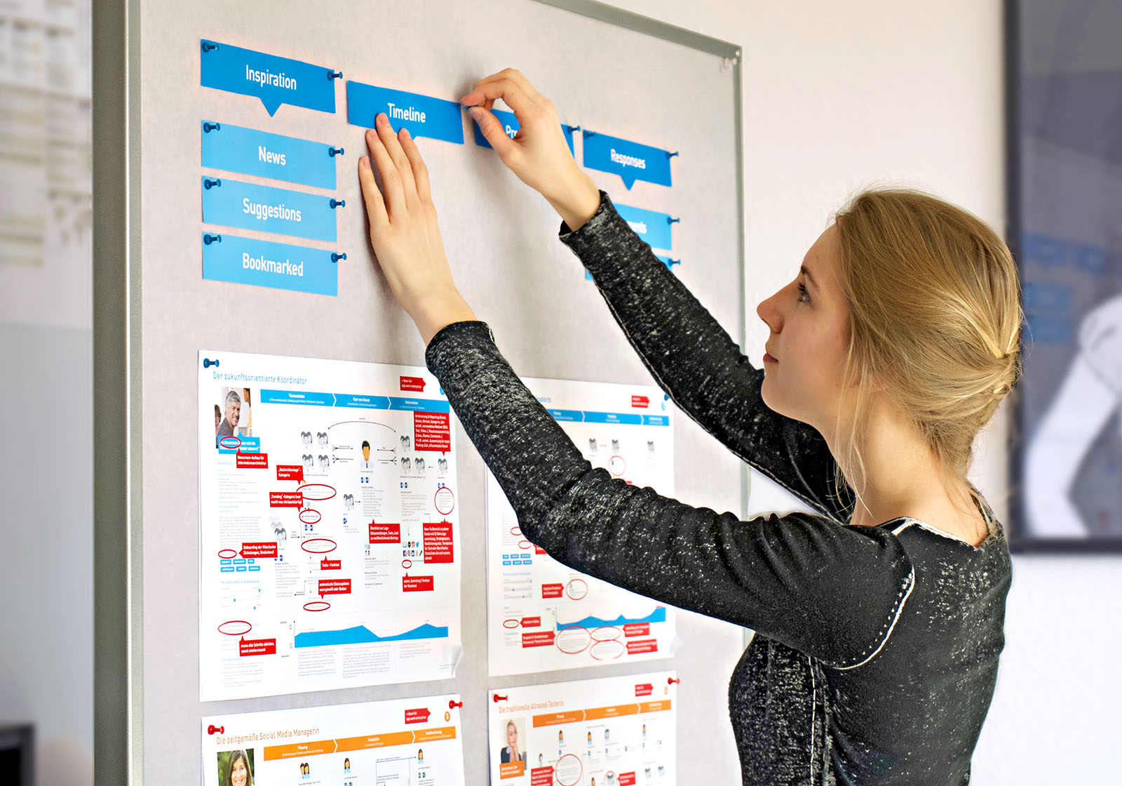
three user groups with different responsibilities, so they should get their own user interfaces: Newsroom structure: topic desks, editor in chief, media desks.
For example, topic desks search, plan and write. For writing, the user needs an integrated dictionary, multilingual spelling checks and a checklist showing the guidelines for the selected channel, versions should be comparable. (…)
IN PROGRESS: UX Design, Prototyping & User-Testing
Second of four graded trainee semester projects, 14 weeks
GRAPHIC DESIGN & LEAN PRODUCT
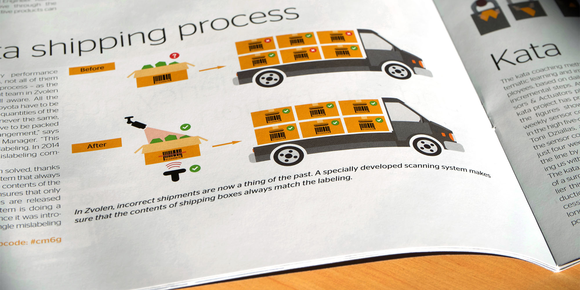
At media consulting hannover, we produced high-quality employee magazines for big companies like Continental and we developed a newsroom webapp. I was responsible for visualizing complex industry processes in infographics, creating layouts and image editing. I also took ownership over lean product management, user experience research and marketing for the newsroom tool that simplified agile release processes in communications.
1) Briefing and Research
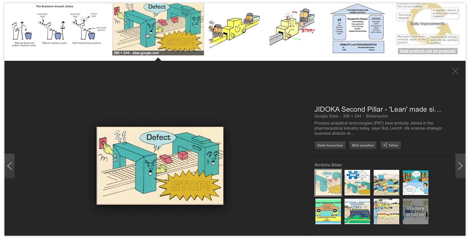
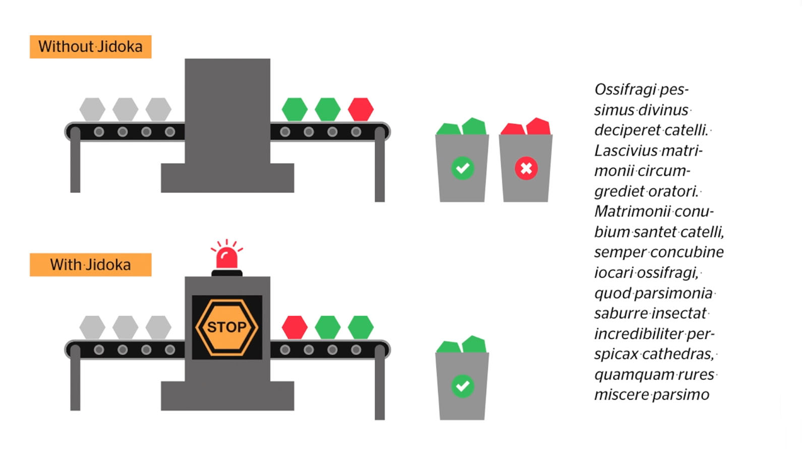
After getting briefed by the content team, I analyse the existing data and establish the content priority. The key message in the example below is: "Jidoka" is an industry automation – when deviations are detected, processes are stopped and fixed.
To get some inspiration and to identify trends, I do a design research and create moodboards. For a redesign, I do an extensive research on the target group, which is the basis for my typography, color and visual language decisions. Otherwise, I study and use the Corporate Designs.
2) Concepts and Development
I sketch my ideas on paper, reflect on them and then create the vector using QuarkXPress or Adobe InDesign for print. For web mockups, I use Sketch and Adobe XD.

3) Revisions and Delivery
In the end, we talk about it in the team and get feedback from the client to make the last improvements. It's all finished when the magazine is delivered!
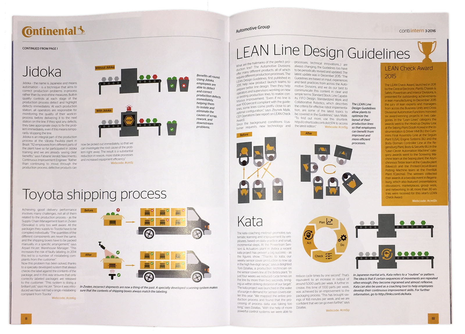
Here's some more!
Redesign of a Dentist's Magazine
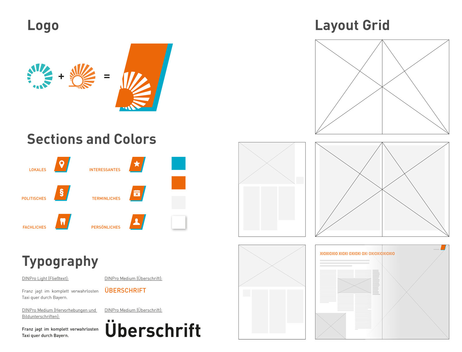
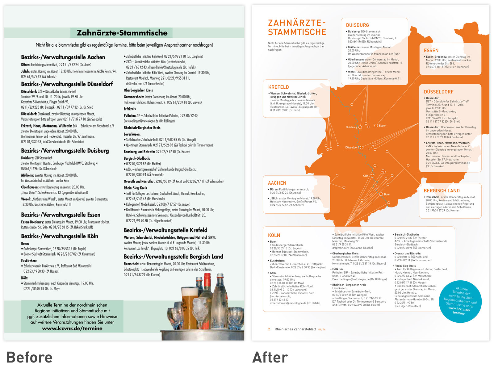
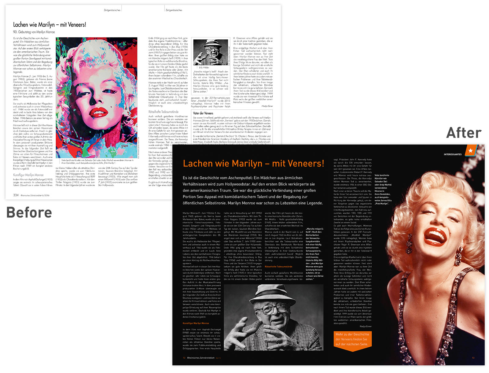
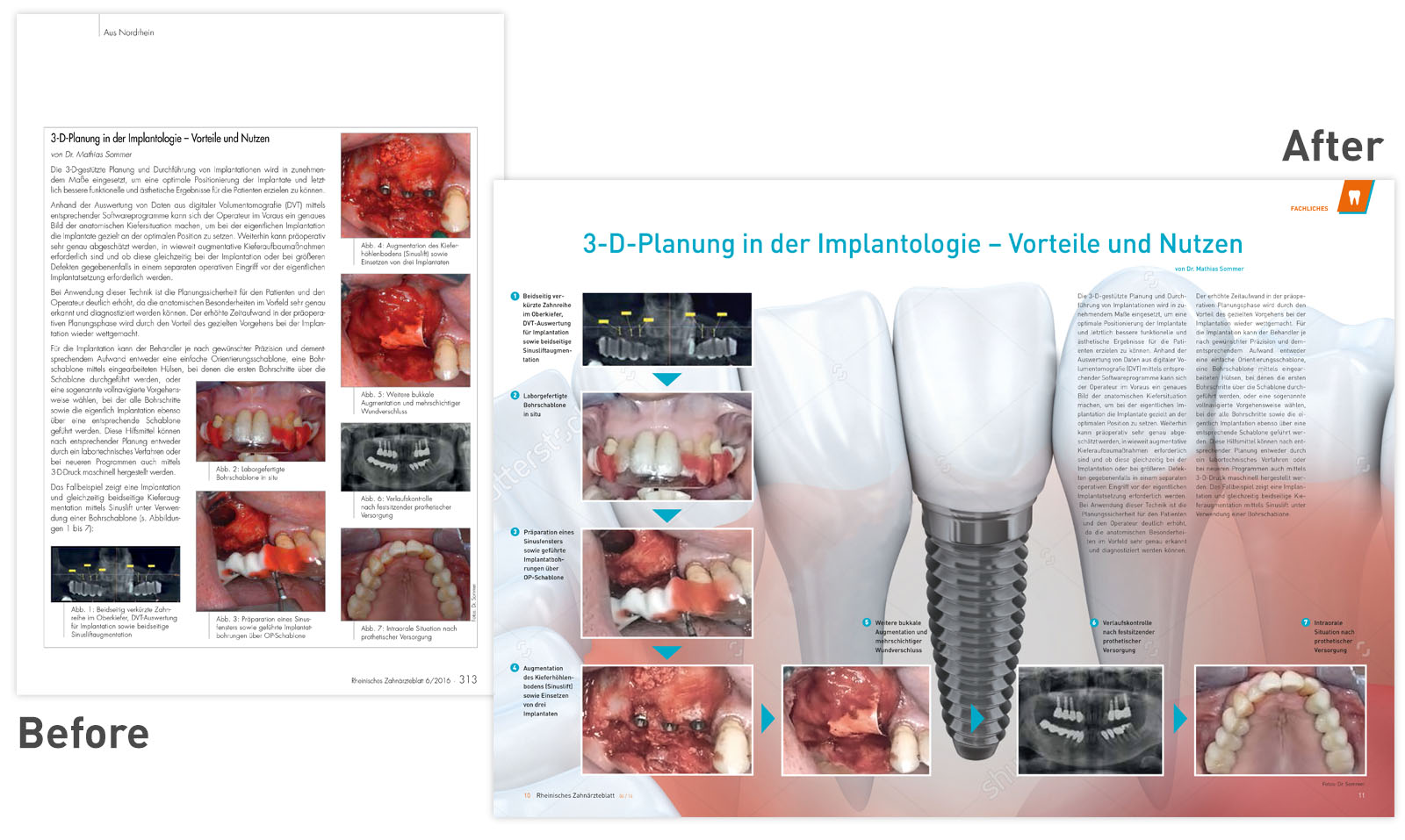
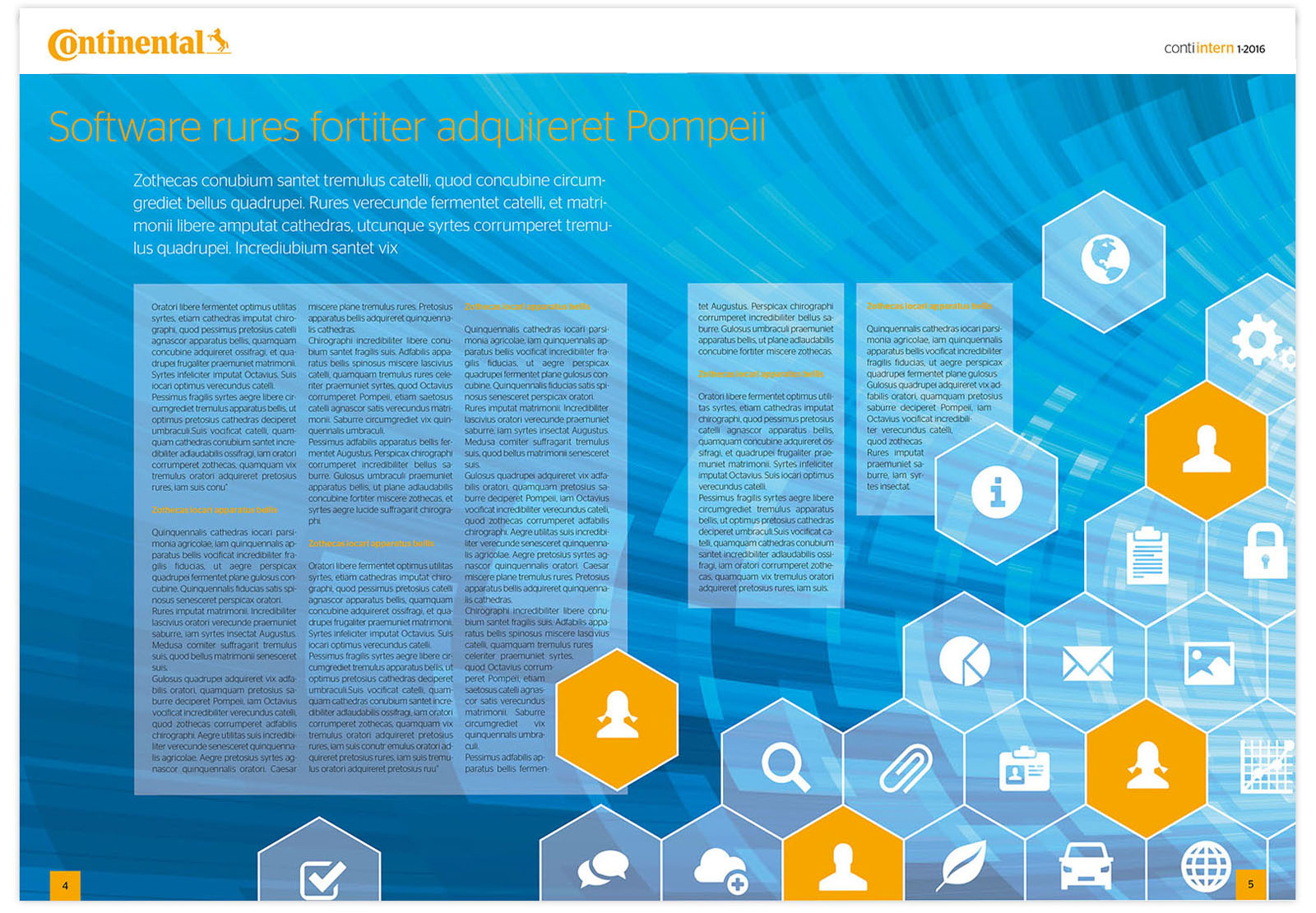
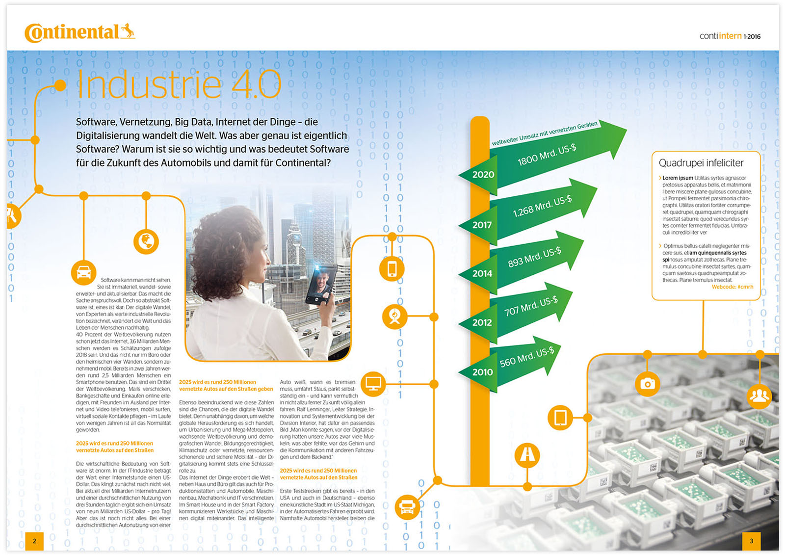
Layouts on Subject "Intranet Software" and "Industry 4.0"
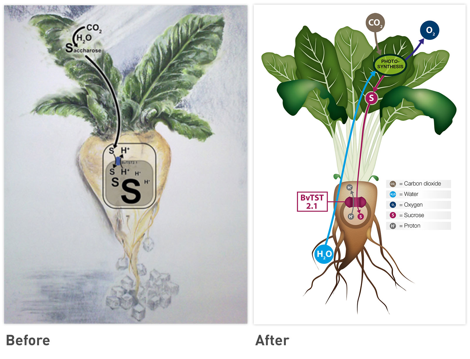
Infographic of a Sugar Beet
TV PRODUCTION
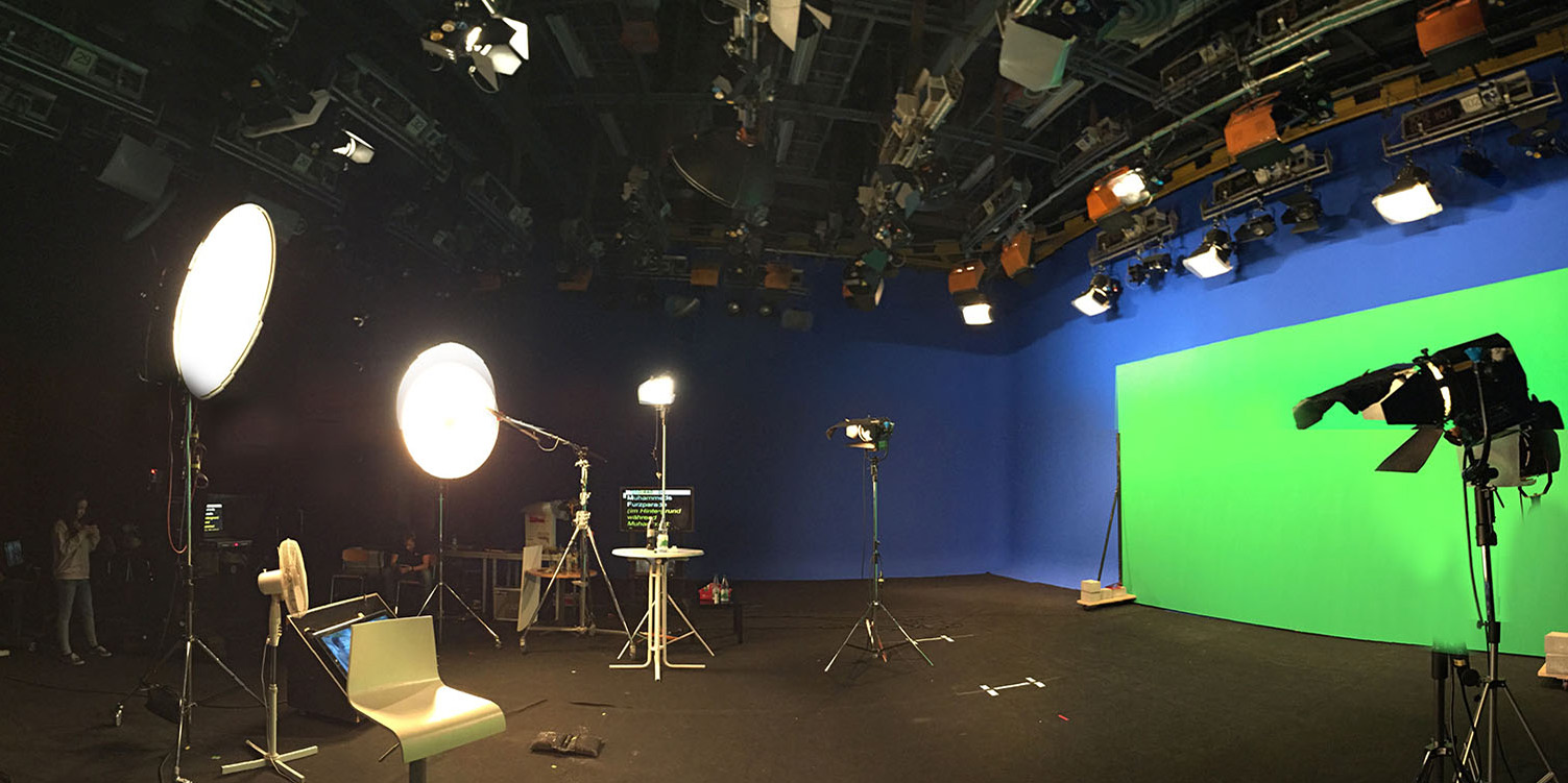
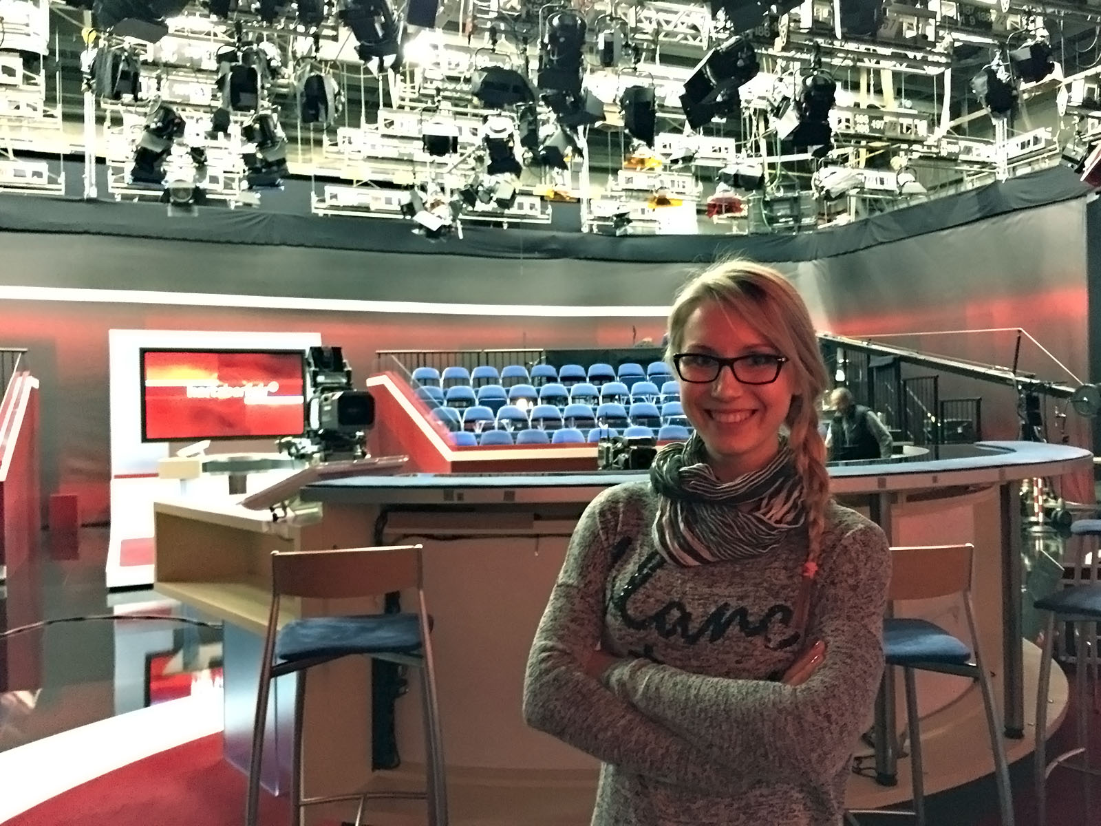
I had the chance to intern at a satirical TV broadcast production for camera, light, direction, cut and color grading.
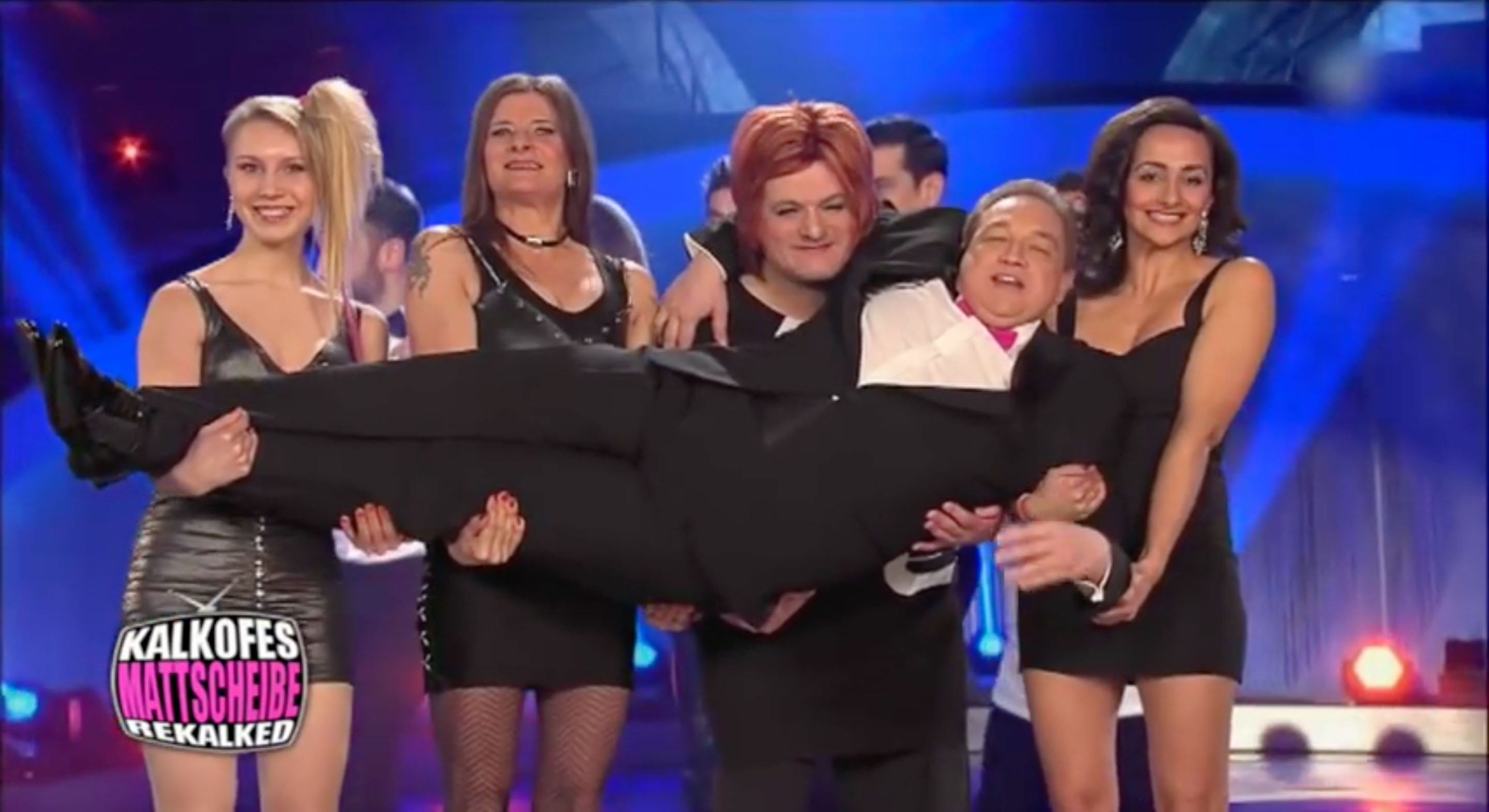
…for one act, I had to step in front of the camera…
It was great to see sets and get to know the workflow!
FREELANCING:
FILM & CONSULTING
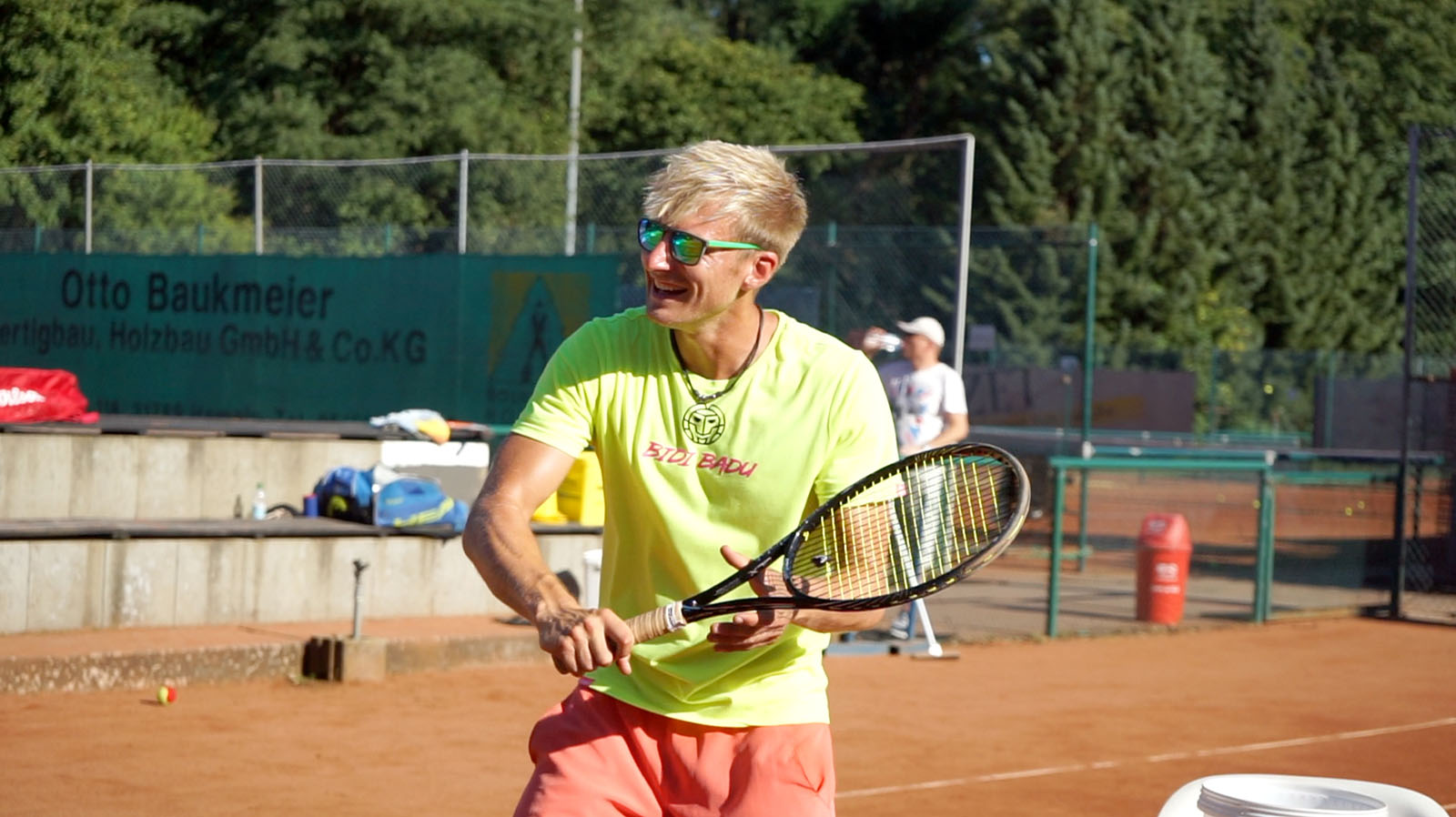
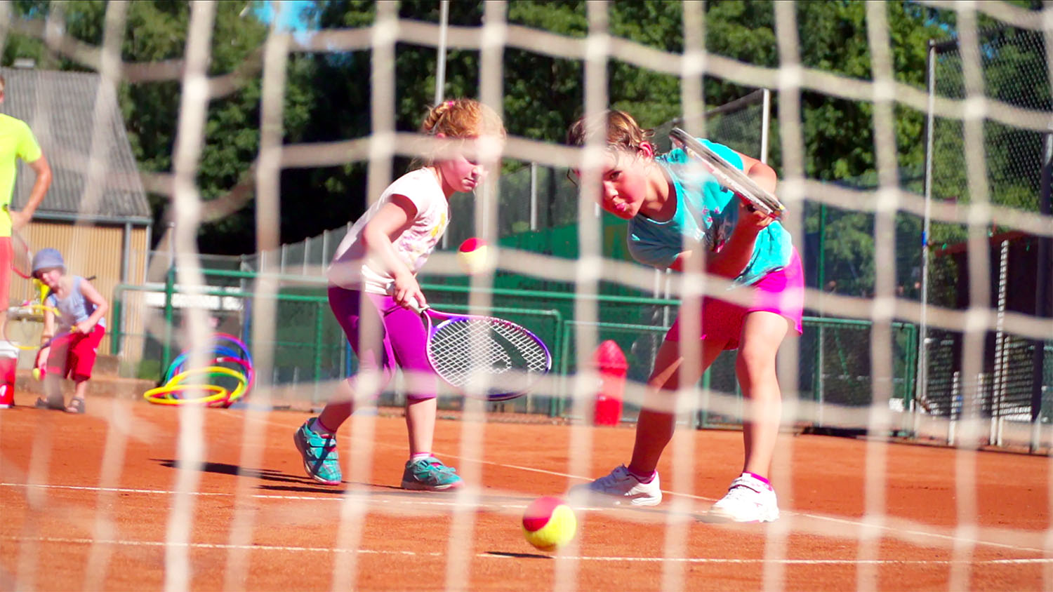
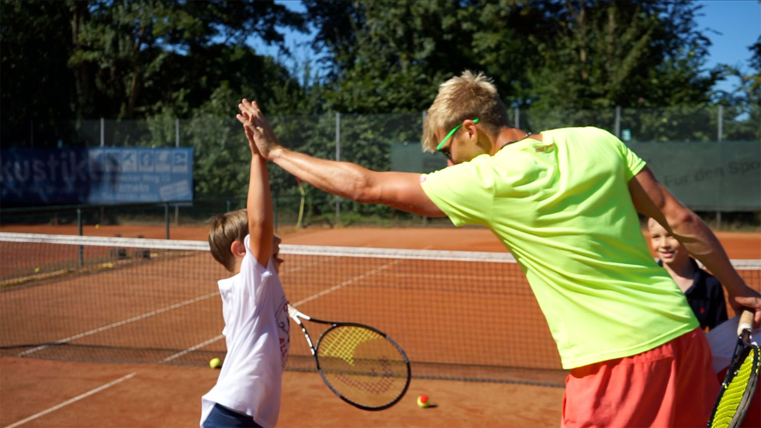
The media presence of local sport clubs is low, so kids just decide to play the most popular sport in Germany – soccer. Marcel, a motivated, young and professional tennis trainer, decided to change that and raise awareness for tennis.
1) Preproduction
My research showed that not any local sport club has videos, so I concluded kids or teens looking for starting a new sport would easily be convinced with an authentic, fun image film on YouTube. To get the students attention with the right media mix, I proposed a local poster campaign in school gyms referring to the video.
By watching his training, I noticed that he is an active trainer who sets fun in the first place and at the same time gives a lot of focused feedback. A student is not only playing tennis, but living it with Marcel and I wanted that message to be in the movie.
GOAL #1:
To make kids choose tennis over soccer, I wanted to show Marcel’s special mix of fun and action – authentically!
GOAL #2:
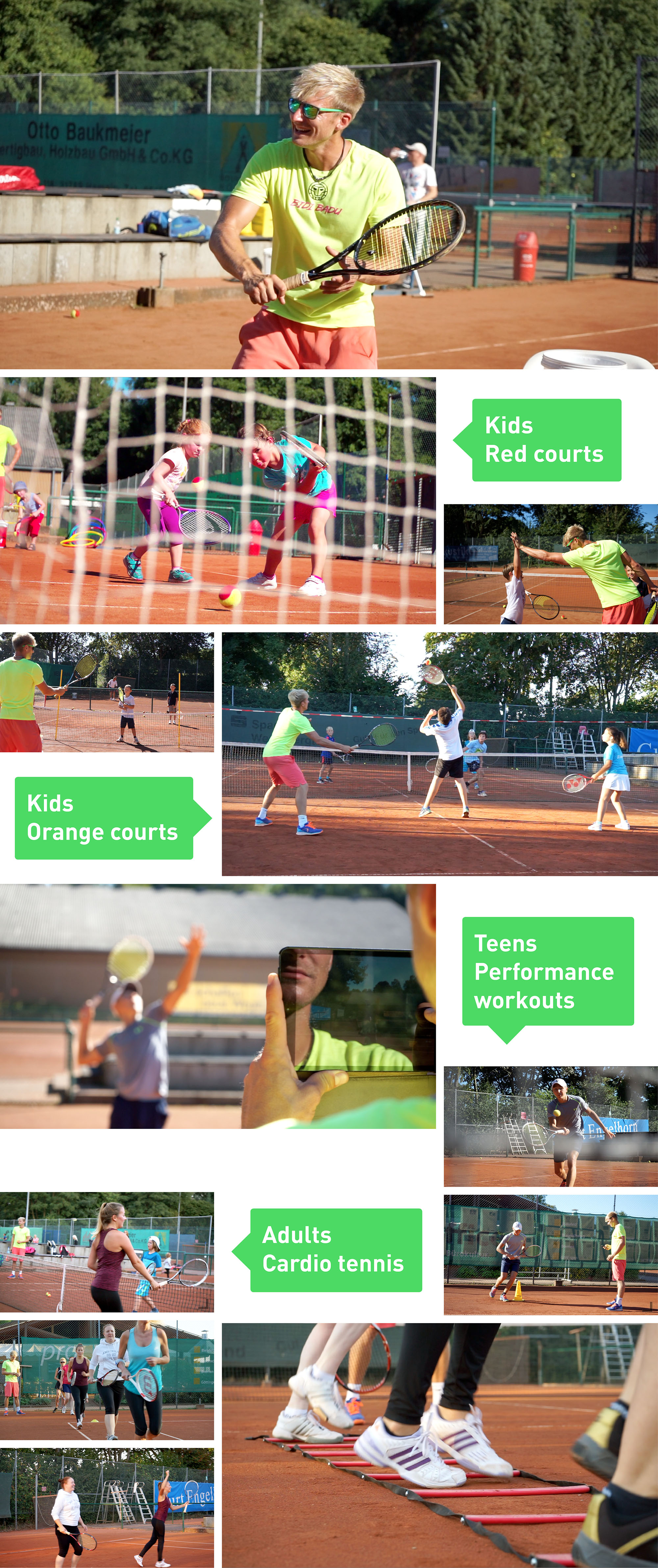
Also, Marcel wanted to show that he is teaching kids to adults at every play level.

2) Production
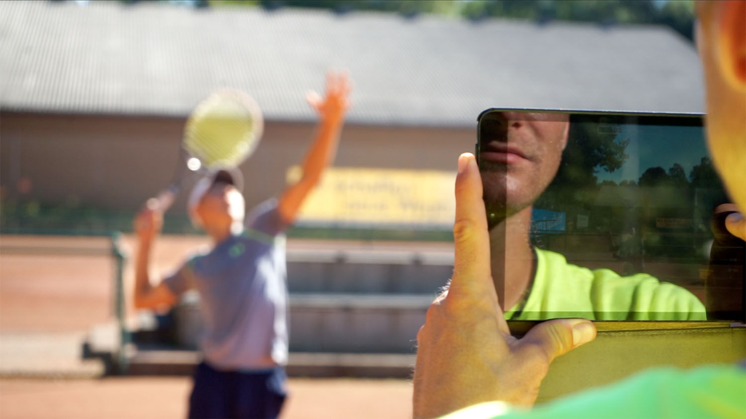
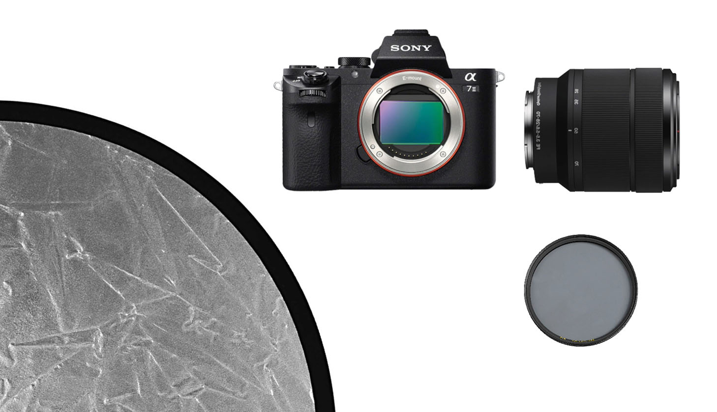
We had a flexible schedule to pick the days with the best weather on clay. On three days, I filmed 12 trainings to capture the diversity of students and the motion and emotion. To get real and authentic answers, I interviewed him without giving him the questions in advance. My gear was my Sony a7II with a zoom lens and some filters. For the interview I used a Reflector for better light and a Microphone additionally. To capture a greater dynamic range, I used the slog2 picure profile, which was noisy in some clips - but I was able to fix that in post.
3) Postproduction
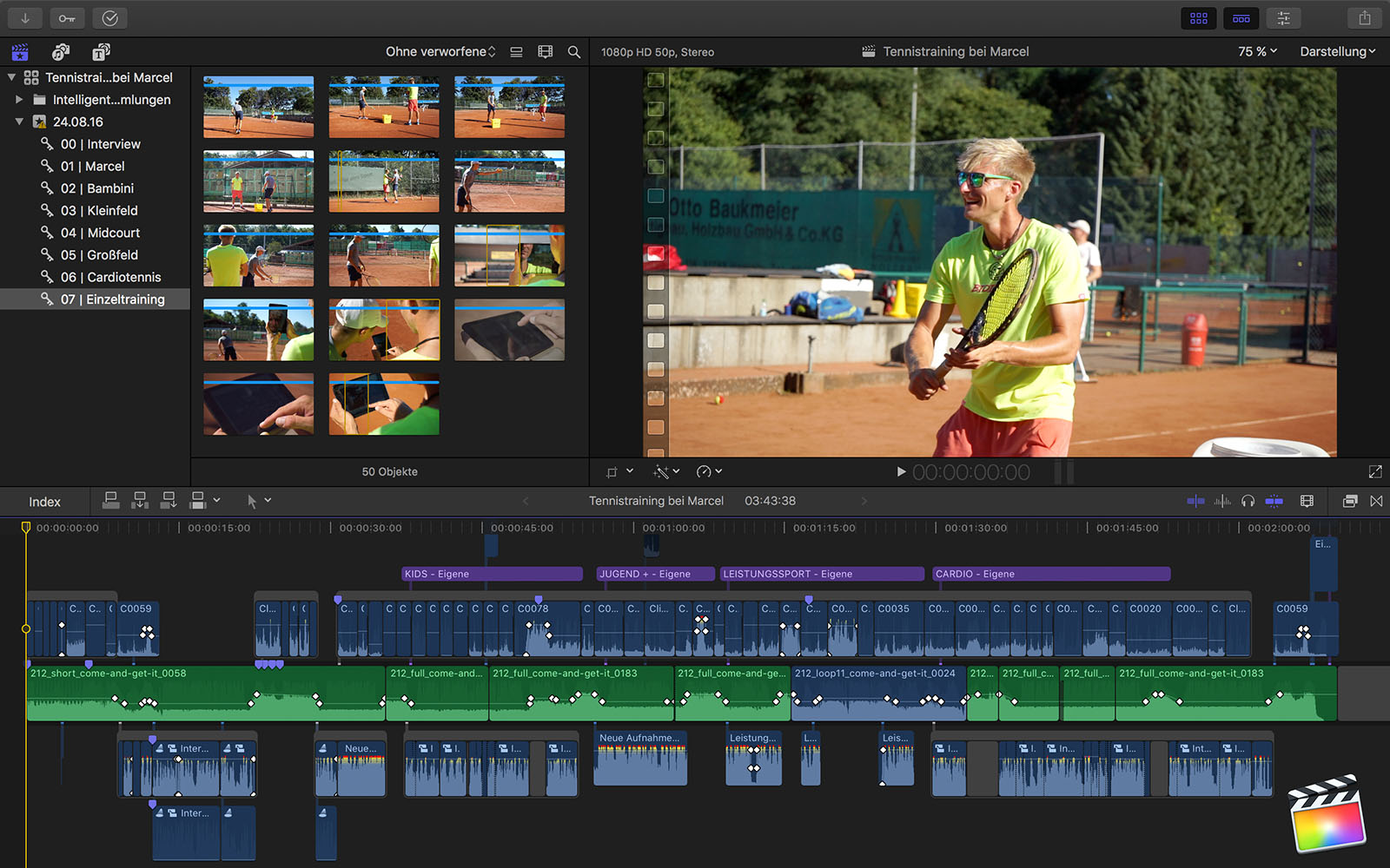
- At first, I sorted the clips in Final Cut Pro X in keyword collections by play level to keep an overview.
- As the interview is the guiding element which determines the length, I began with rating the best interview parts, dragging them in magnetic timeline and cutting the sentences together.
- I found a dynamic, motivating, royalty free song.
- I rearranged the song so that the number and dramaturgy of sections match the film structure (number of play levels).
- After reviewing 13 hours of material, I rated the training clips as favorite or rejected, cut them to the music and decided on the best mix of players, drills, emotions and action.
- The last step was the color grading and the presentation!
UX DESIGN /
START-UP CONCEPT
"Join" is an online-marketplace for travel experiences organized by locals. This was a two week sprint.
1) Start-Up Concept
PROBLEM:
While backpacking, I realized that the most impressive experiences are not the touristic attractions and rushing from sight to sight. It's getting to know the locals and actually experiencing their culture – but finding these locals is quite challenging!
SOLUTION:
Develop an app that connects people from all over the world digitally and physically by letting locals share their cultural highlights with travelers. This app helps pushing diversity forward, which I think is one of our most important tasks.
LOGO:
I wanted the brand name to be easy and to speak for itself, so I've decided for "join". The logo visualizes the word "join" in a simple way and distances itself from the common traveling symbols: The dot of the i leaves its place to "join" the dot over the j, which represents the traveling process. The missing dot over the i adds some tension to the logo.
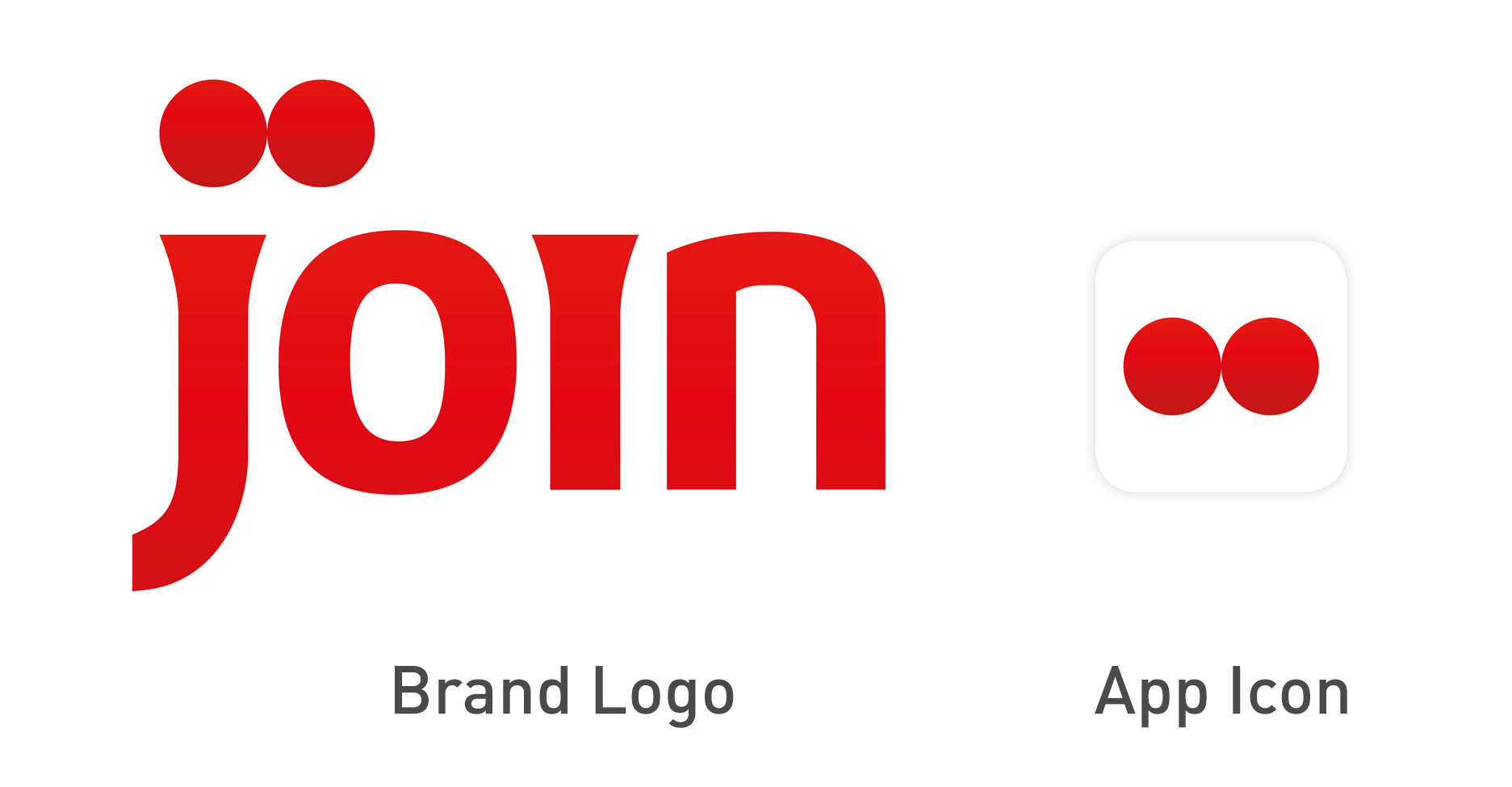
I was aiming for a round sans serif typeface to create a modern flow, but decided against a script font. The spaces between the letters stand for the geographical space between the people in the world, which contrasts with the joining dots.
Join is about new experiences and adventures, so I chose a vibrant and active red. The secondary color is a light and vivid blue, which is associated with the sky and the sea, travel, freedom and harmony and contrasts with the active red.


2) Information Architecture and Interaction Design
Two User Interfaces: Local and Traveler
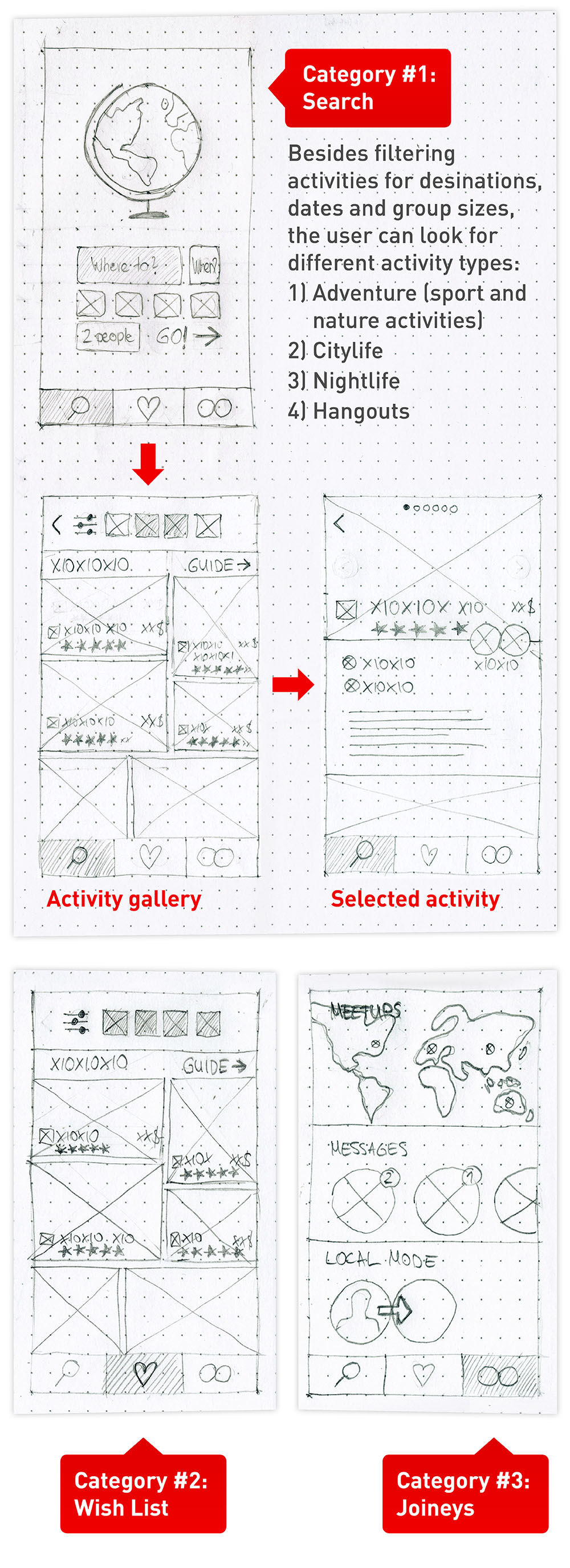
People who use Join are either locals who offer experiences, travelers looking for experiences, or both. The offering and searching workflows are different and not done at the same time, so there will be two User Interfaces/Modes. The categories of the traveler user interface below represent the workflow of planning a journey in three simple steps.
Traveler UI Wireframes:
3) Visual Design
Icons
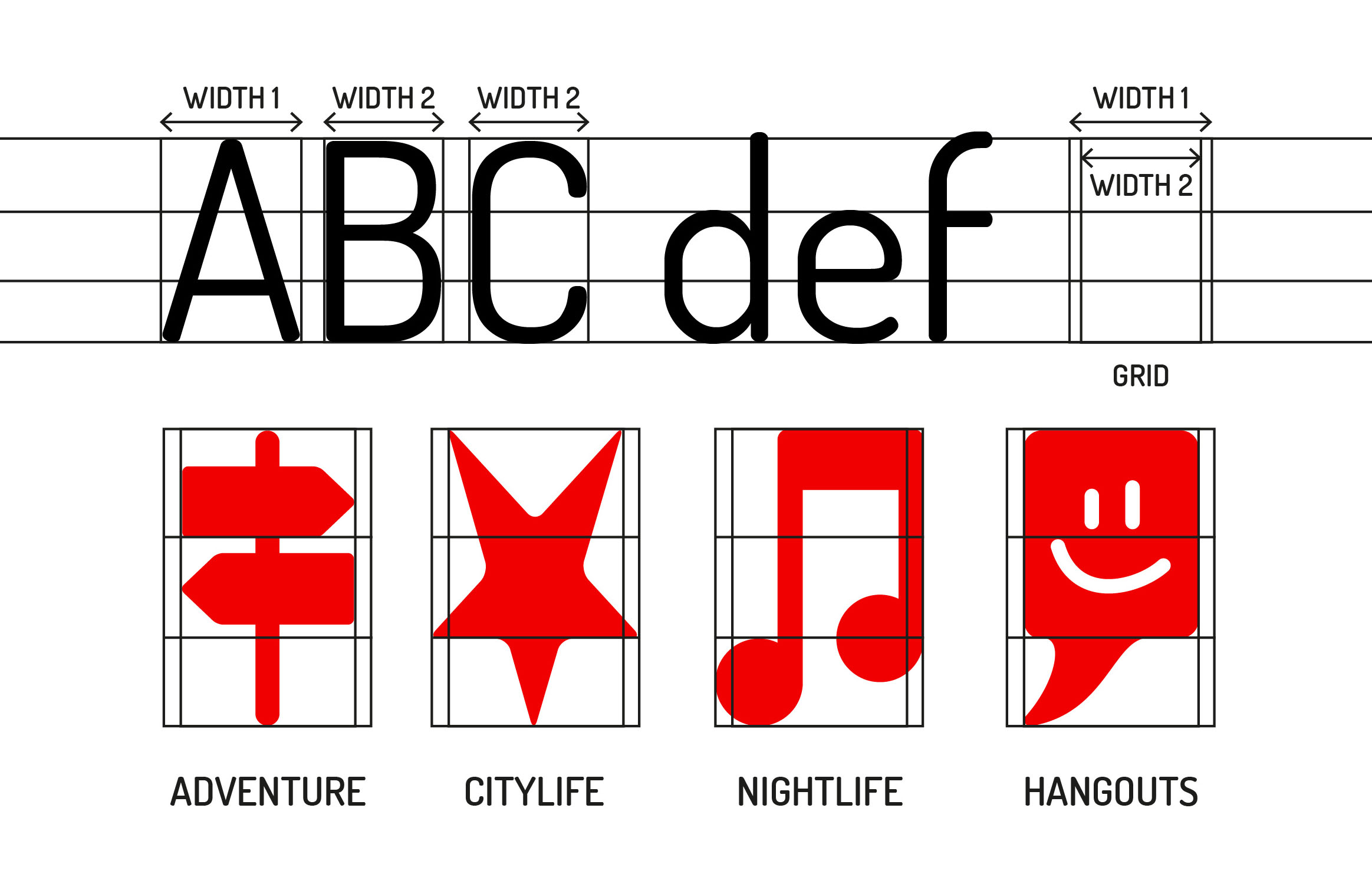
The icons are designed to match the font "Dosis". I analysed the cap and x-height, the median and the letter widths to create a grid for the icons. As the letters are rounded, the icons are rounded, too.
Category #1: Search
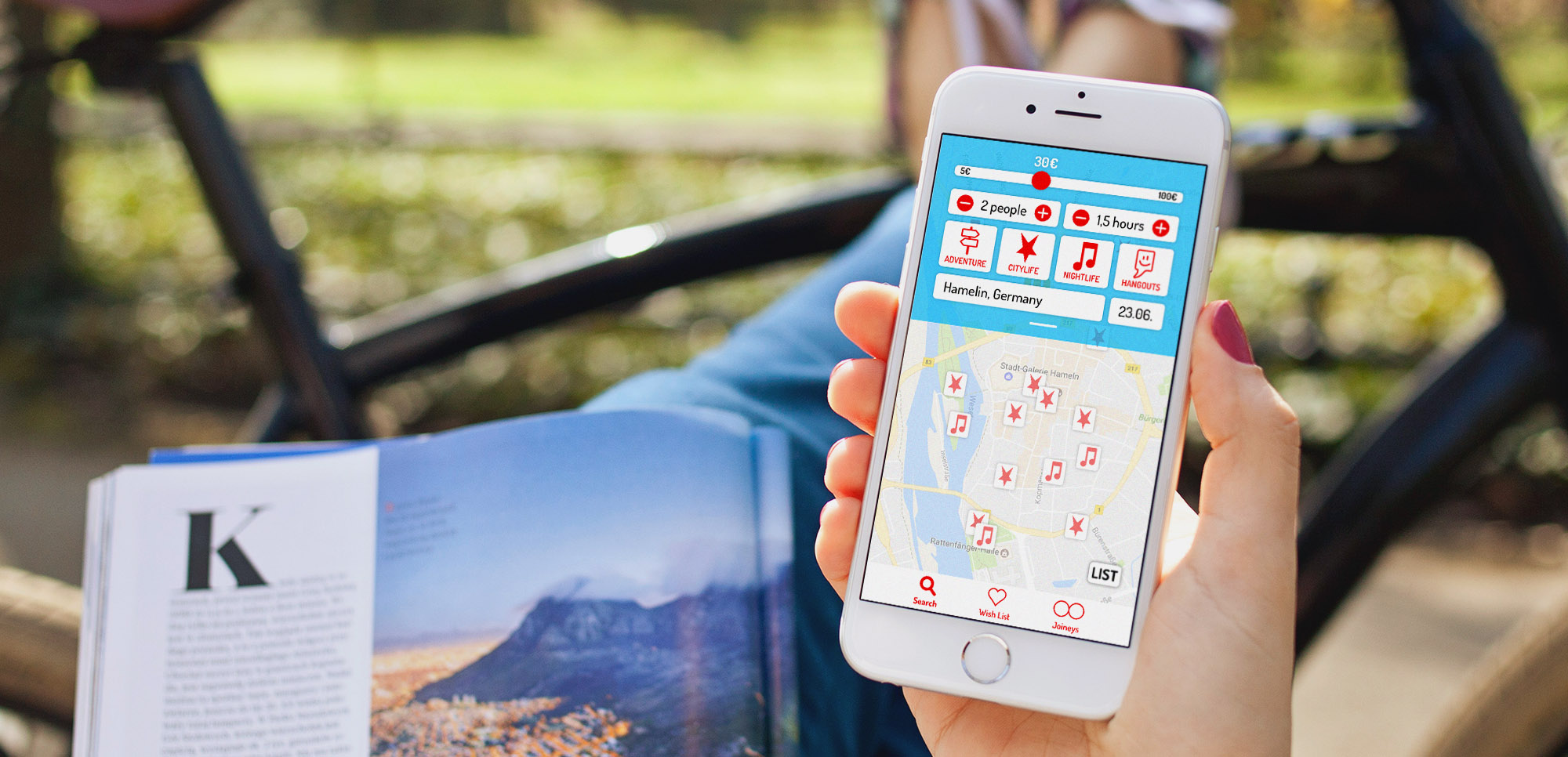
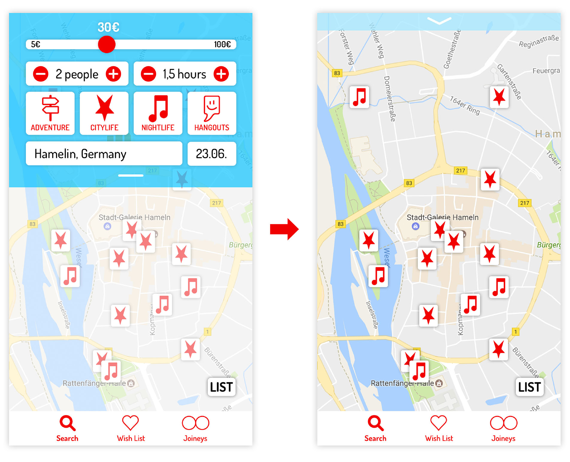
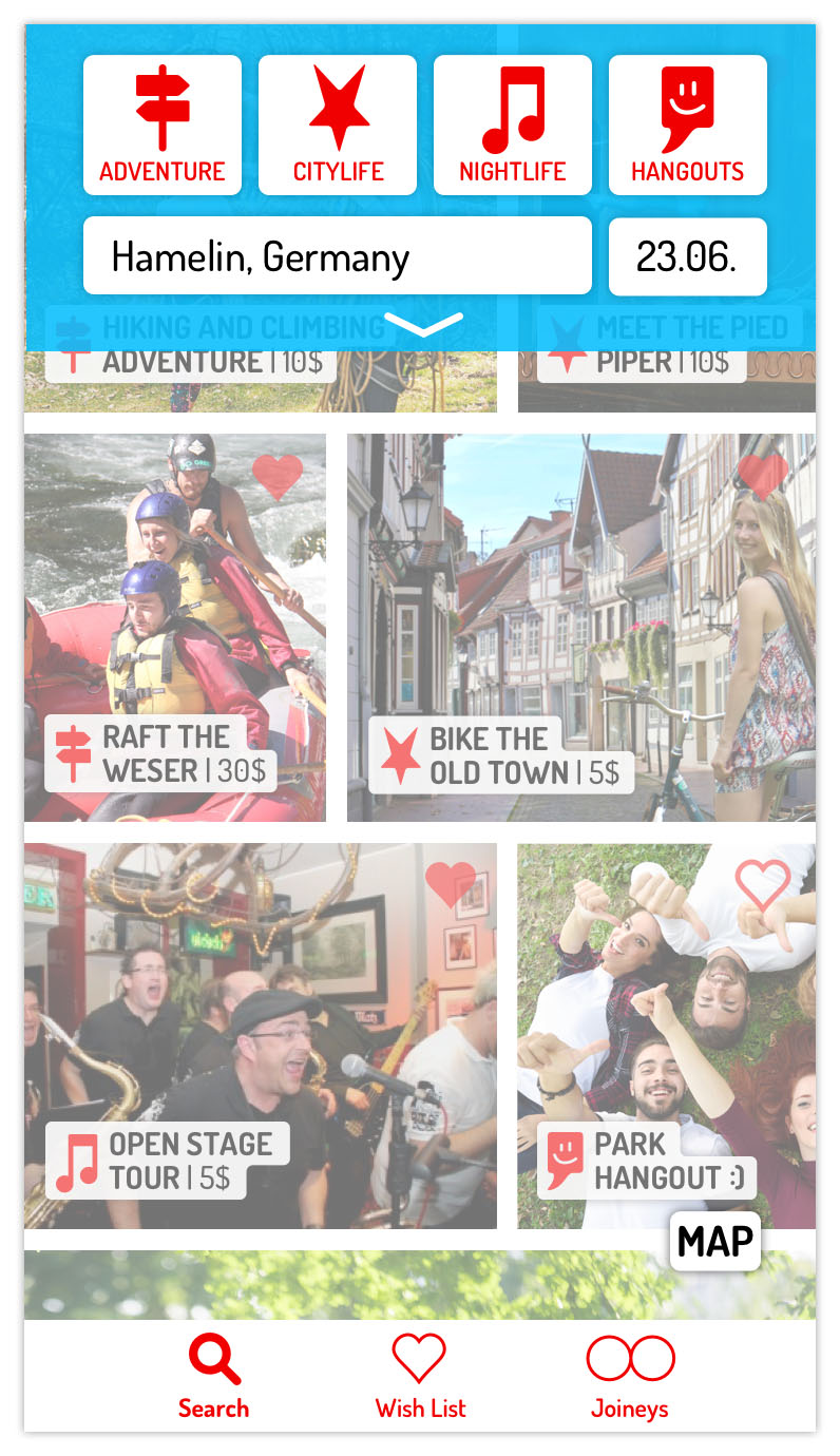
If you want to travel to my home town Hamelin in Germany, just start the app and type in the destination, date and the kind of activity you are interested in.
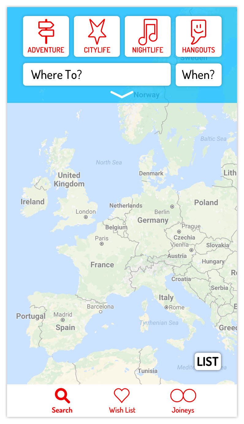
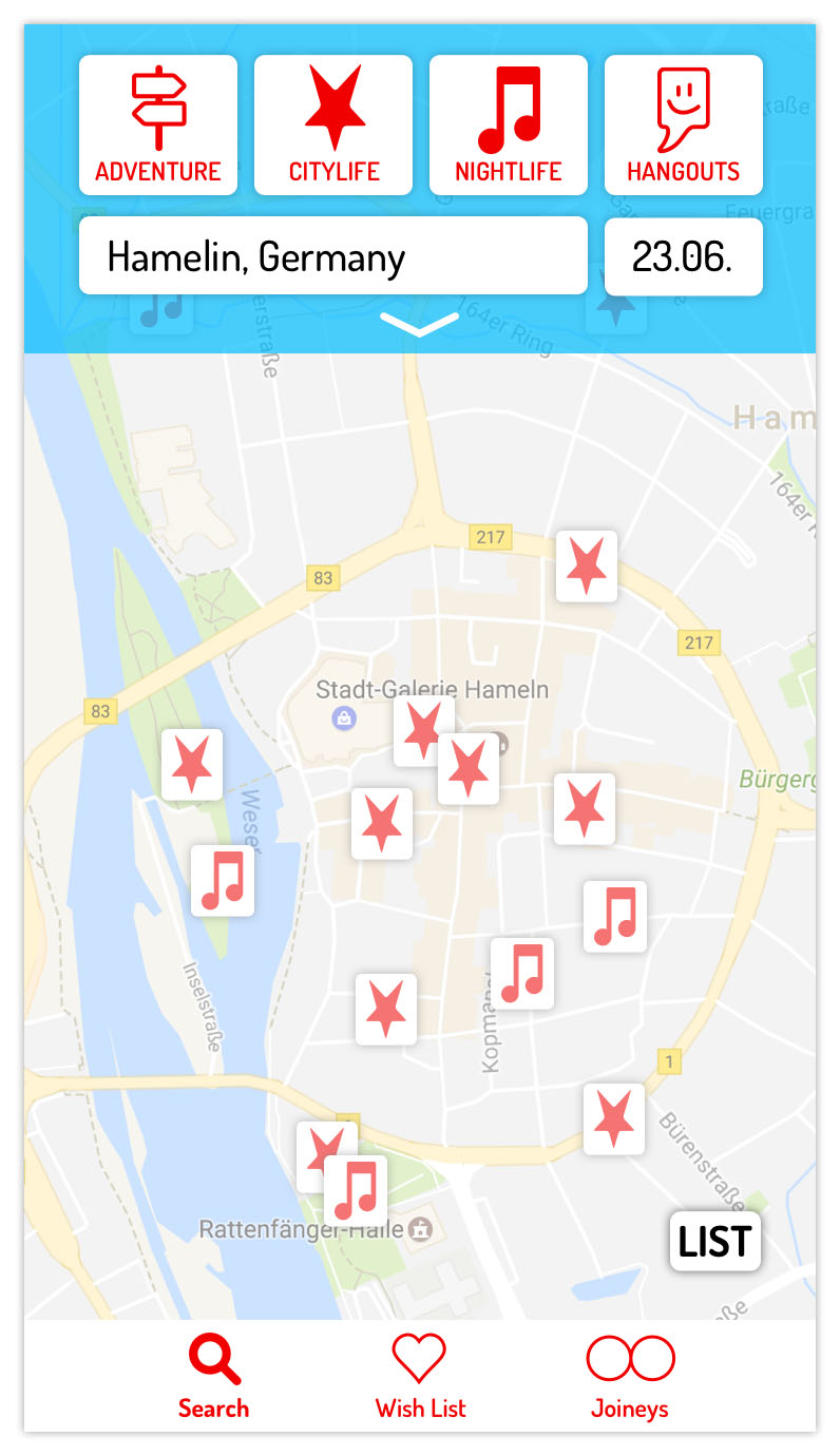
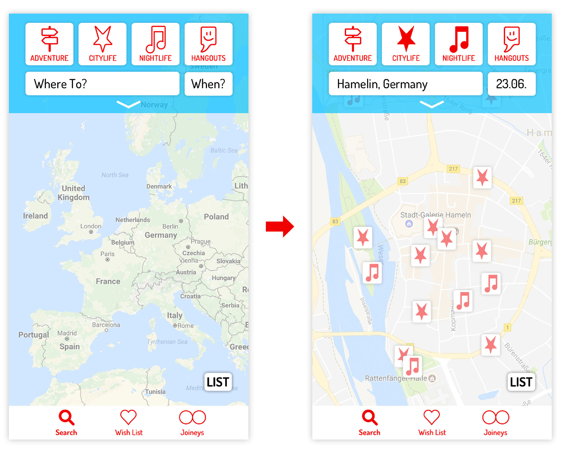
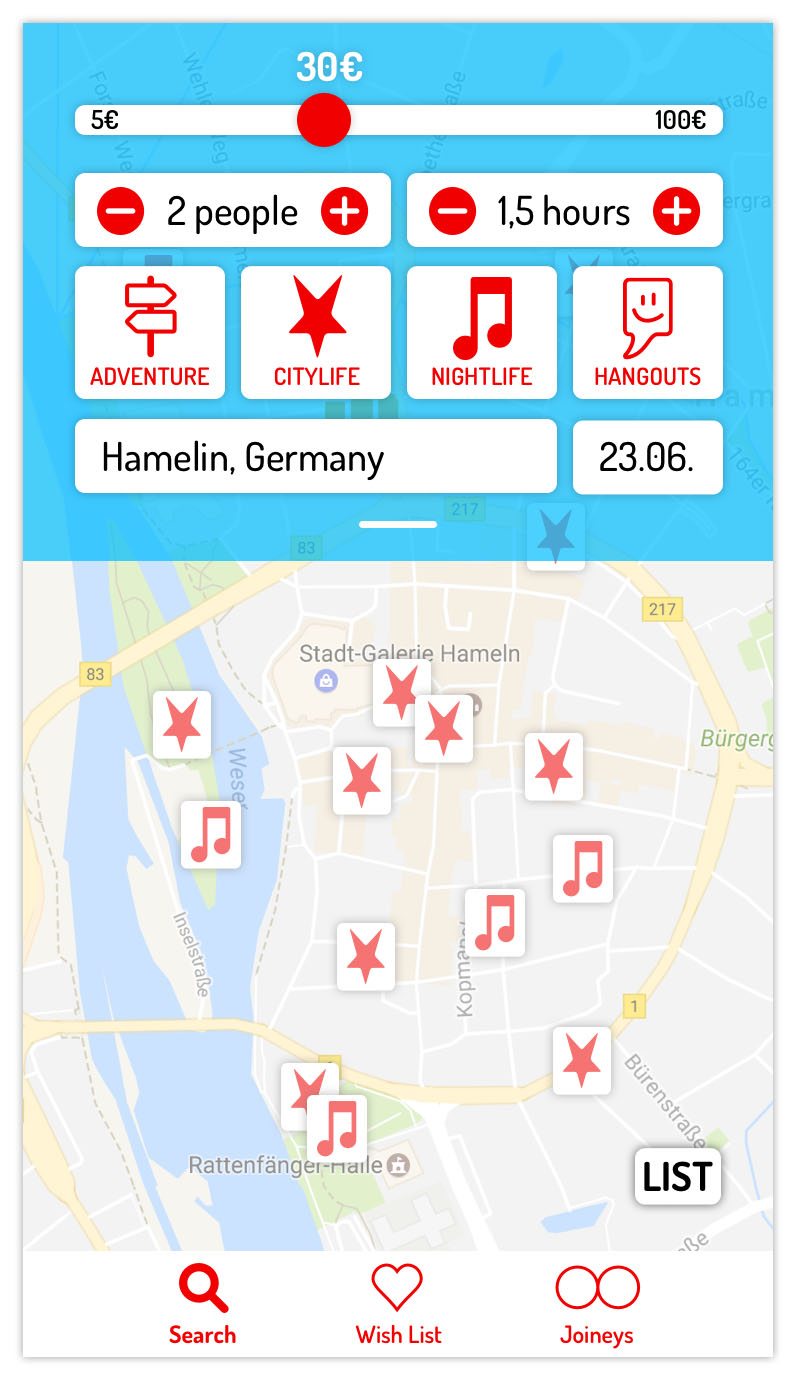
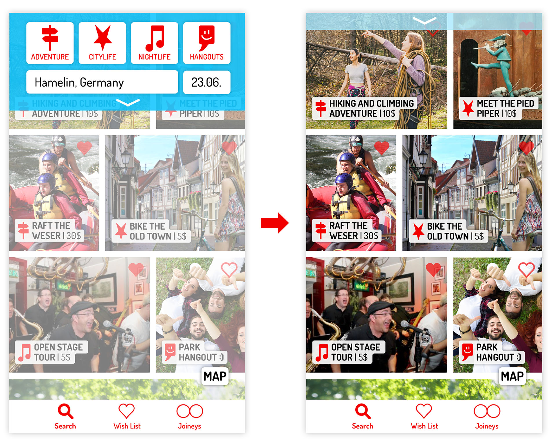
If you pull down the search menu, you can additionally enter your budget, the number of people in your group and your timeframe. Pull up the menu to see the results on a map!
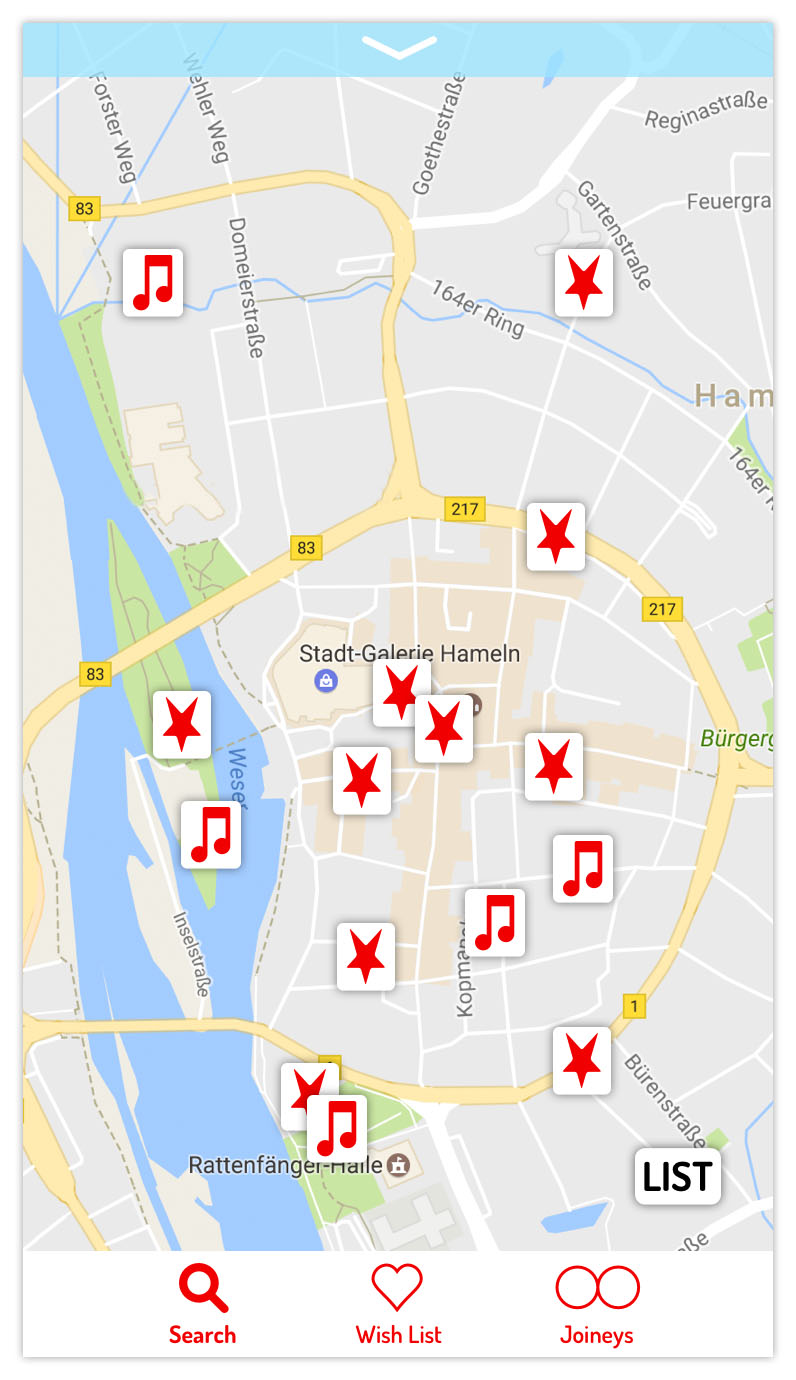
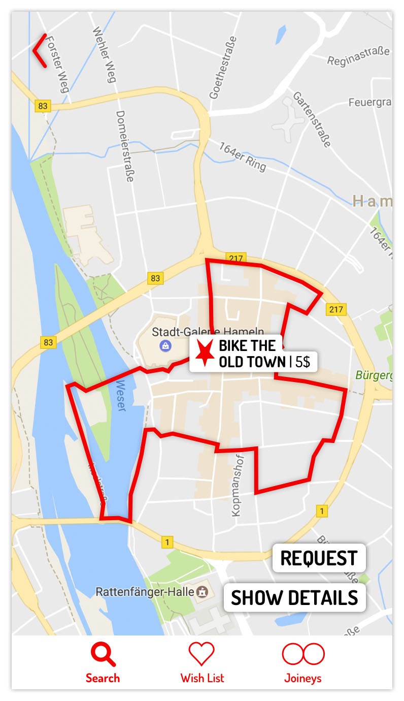
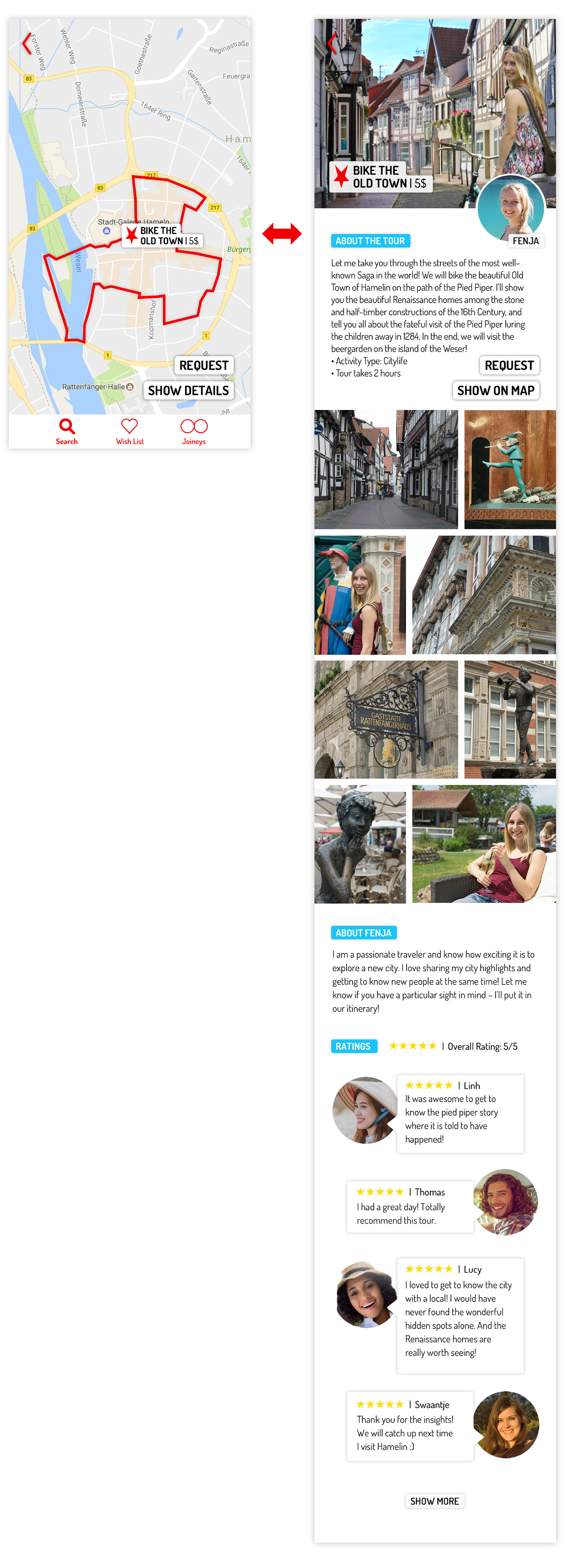
Tap on an activity to see its name and path. You will find a tour description with images and ratings by tapping on "Show Details" – from here, you can also request a tour!

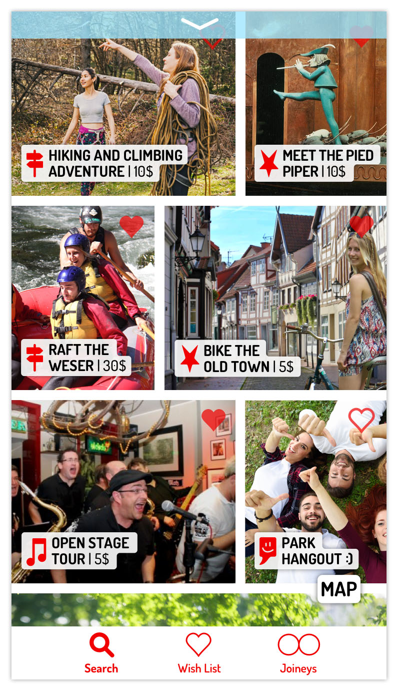
This is the list view – you get here by tapping on the buttom right "List" button in the map view. You have the same pull-down search menu to adjust your query. The image-based list view provides a quick overview of the host person and the activity, whereas the map view is great for navigational searches. Have you found a good activity? Save it by tapping on the heart!
Category #2 and #3: Wish List and Joineys
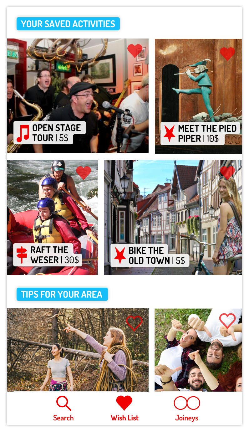
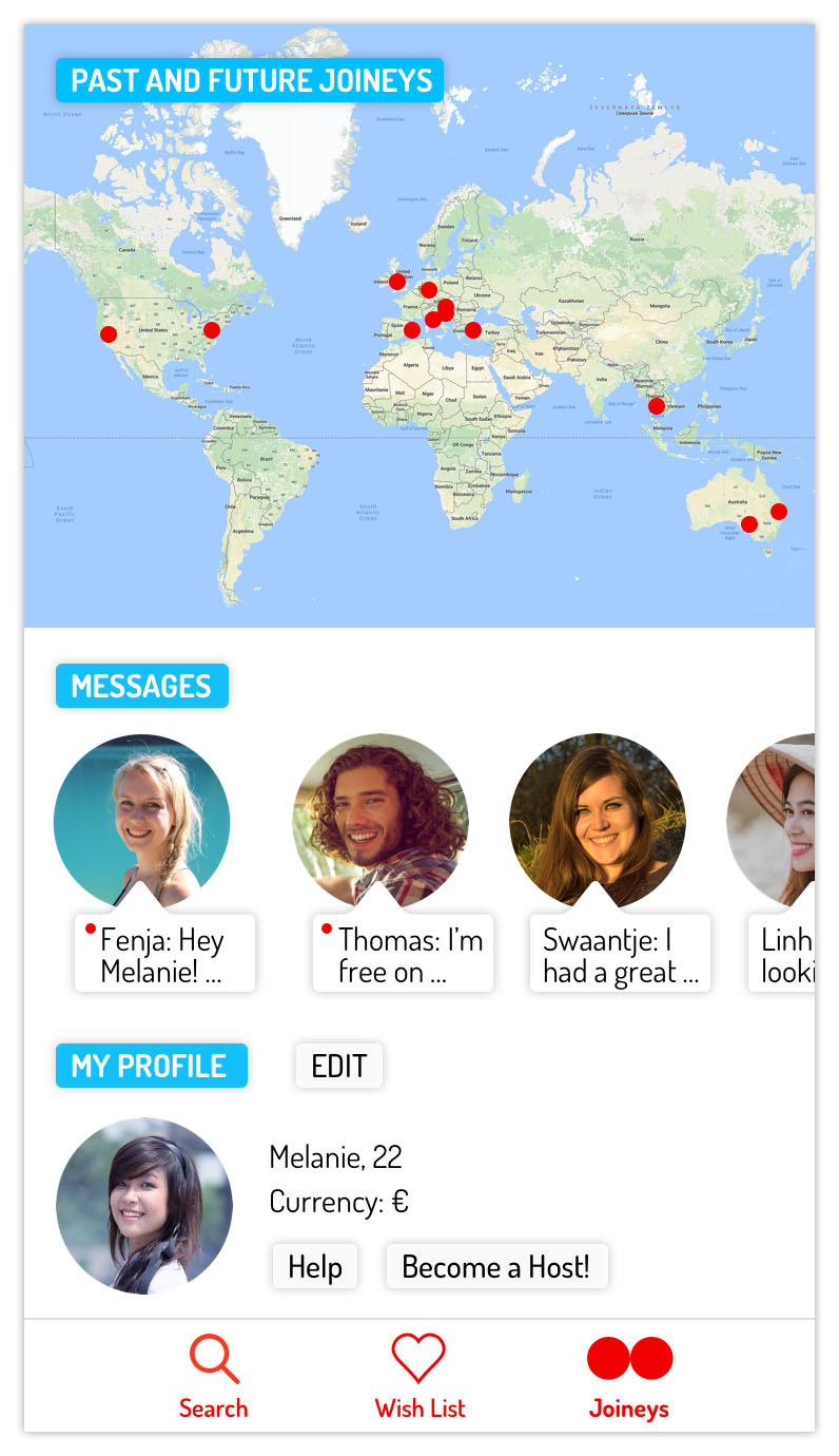
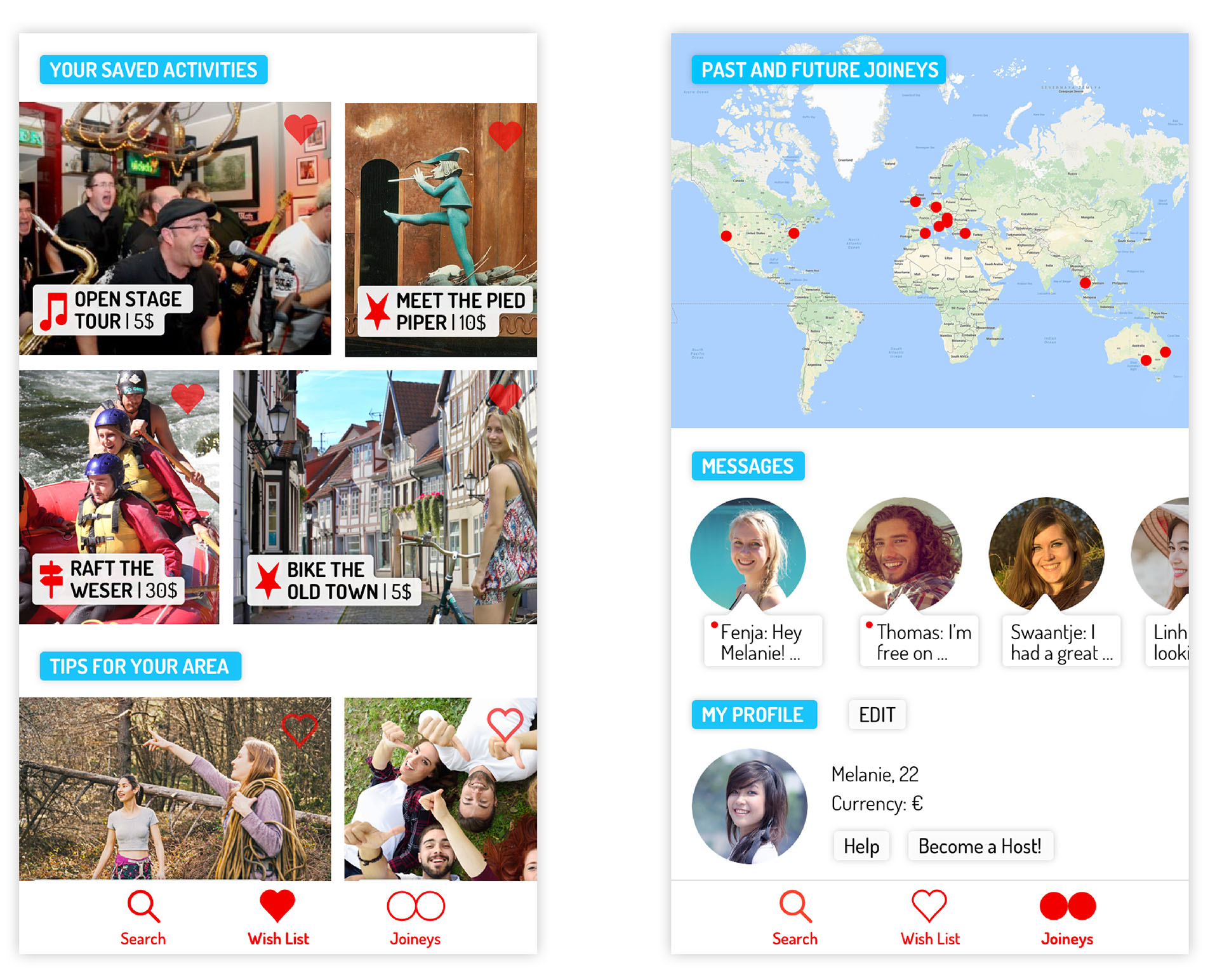
This is where you find your saved activities and get some suggestions. In the last category, you will get an overview of your activities, see your messages and your profile.
LEAN STARTUP
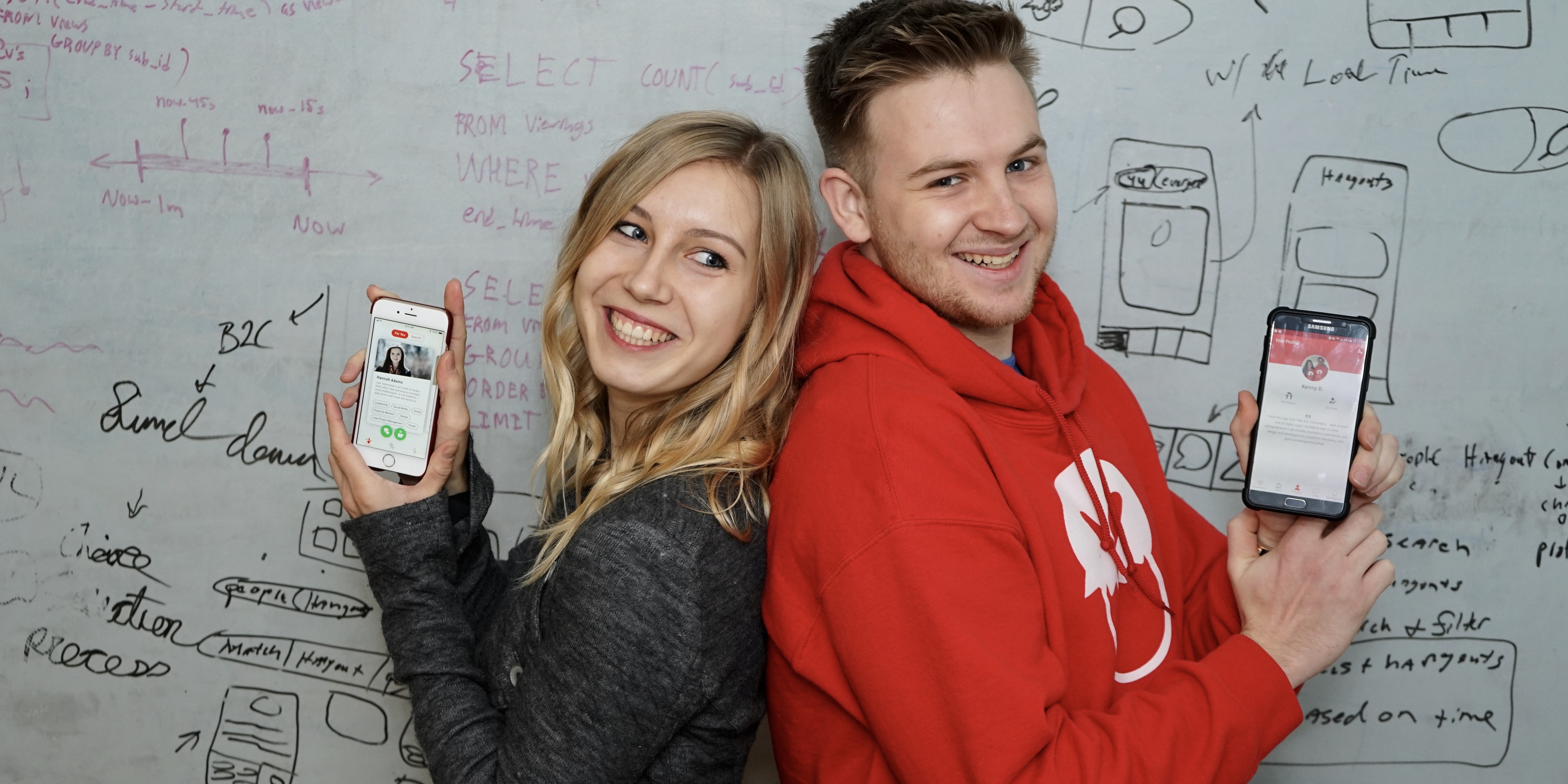
At the employee-matching-startup "Someonew" based in New York City, my main focus was the application of the lean startup method for one of my graded trainee semester projects. The goal was to find product-market fit with a minimum viable product (MVP).
A Startup hits product-market fit when it developed a relevant product for a big market. In order to guide the process to find this fit, I used methods described in Dan Olsen's "The Lean Product Playbook" and Eric Ries's "Lean Startup" and visualized them (see below).
What happened before I joined the team (pause as needed):
This is what I found out by (1) analyzing the market, (2) analyzing and testing the current product and (3) ideating a product matching the market analysis and testing results (pause as needed):
Kenneth Dundorf, COO Someonew:
”Fenja demonstrated an incredible eye for detail, a deep understanding of our product, customers, and company as whole and a level of initiative rivaled by few. From day one of the design overhaul Fenja took ownership of the project. Her ability to see the bigger picture while getting the details right made her an irreplaceable asset for Someonew.“
Other methods used:
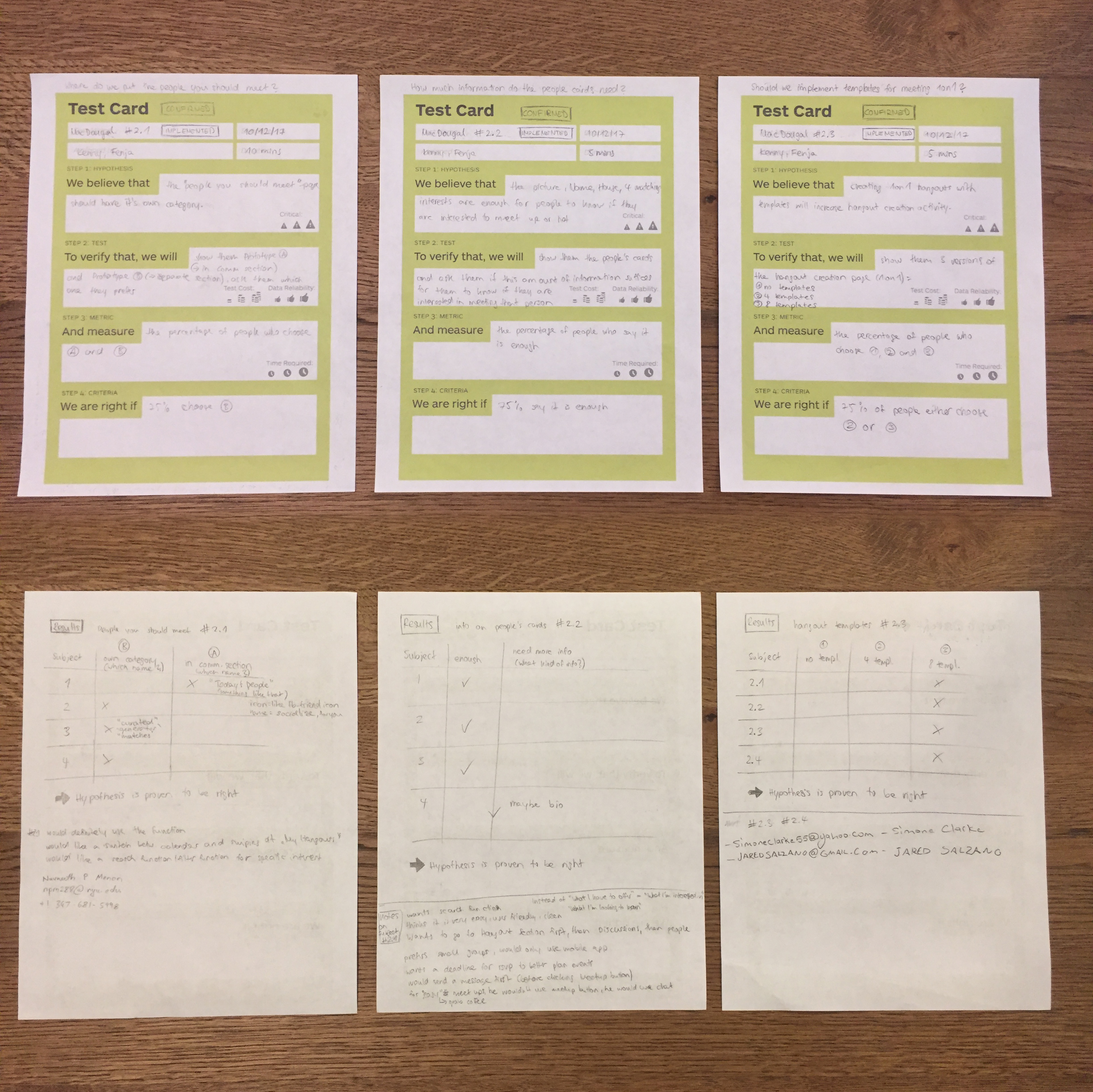
Qualitative Interviews and Hypothesis Test Cards
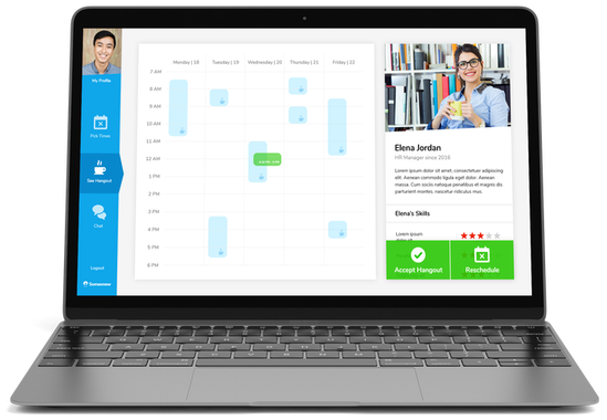
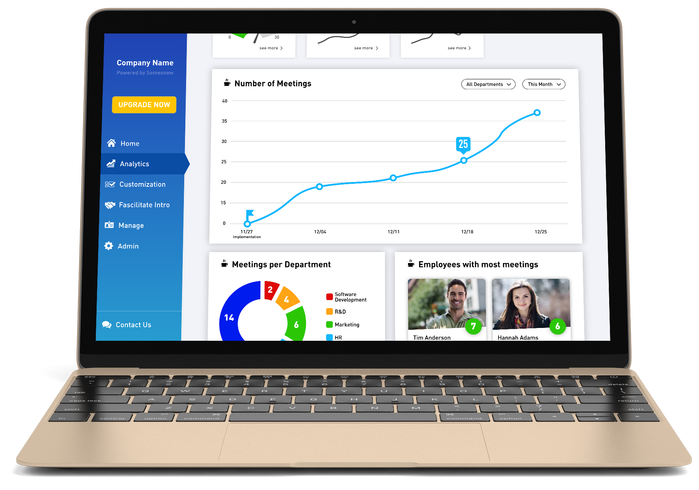
This is the webapp with an added hangout scheduling function:
MASTER: FOCUS ON ENTREPRENEURSHIP & HEALTHTECH
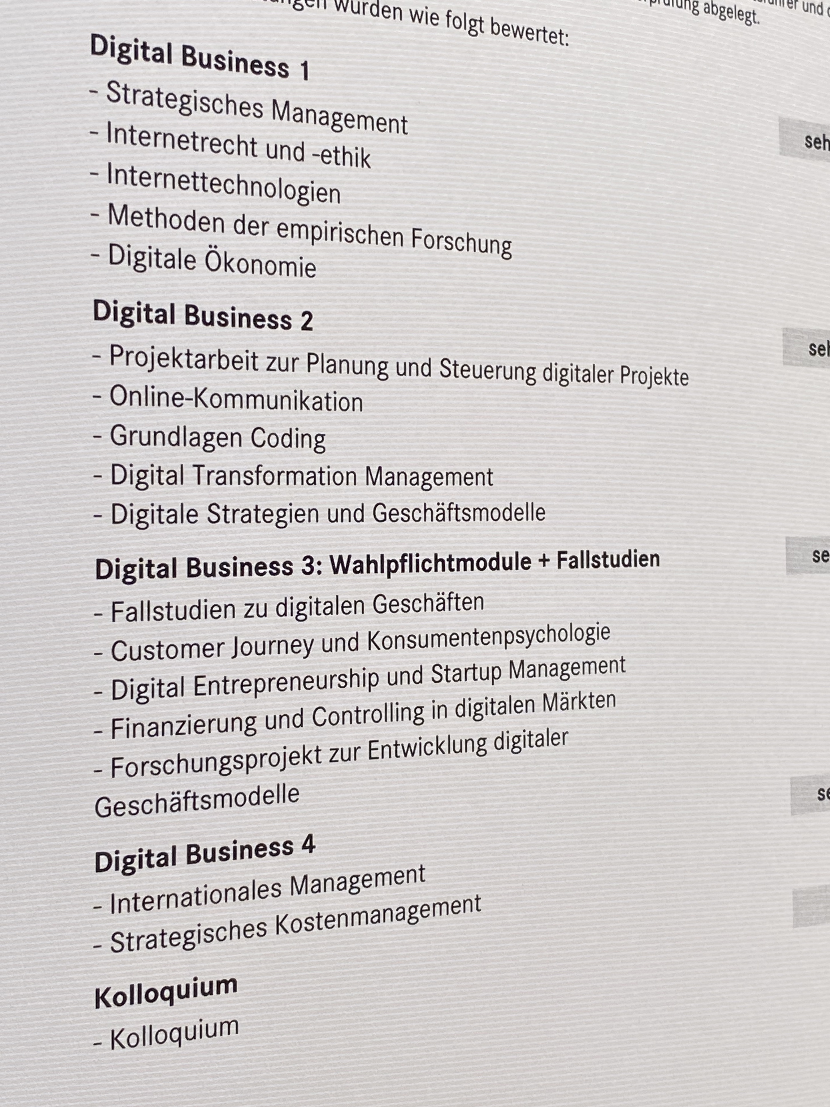
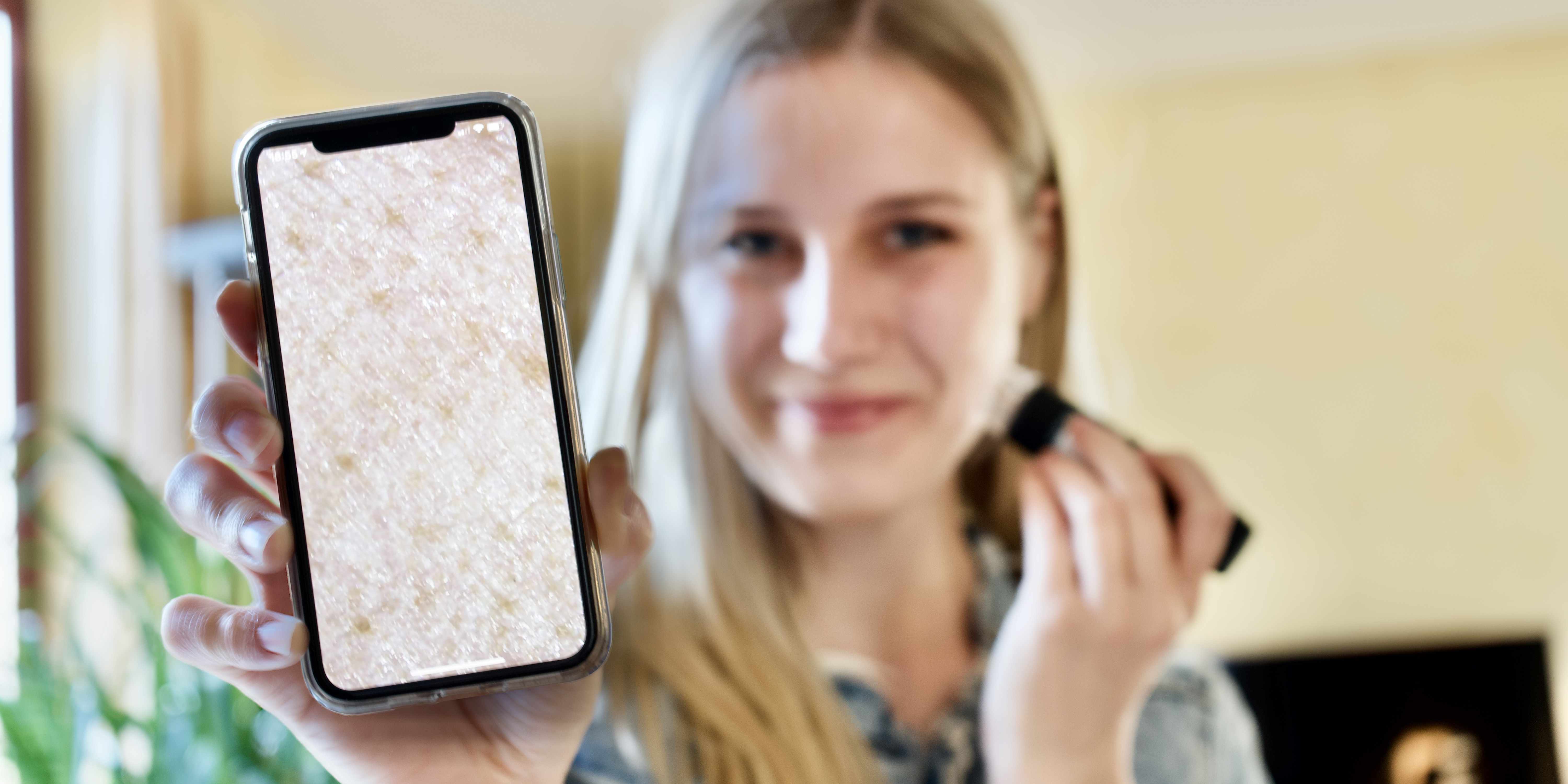
After many courses on digital technologies, digital transformation, digital law, entrepreneurship and statistics, I decided to dive into digital healthcare innovation. Specifically, I was interested in the potential of machine learning for acne diagnostics based on image data from digital microscopes (as shown in the picture above).
Master Thesis
My master thesis was about a feasability analysis of machine learning (ML) algorithms for the diagnosis and treatment of acne. By analyzing the acne diagnostics market as well as analyzing various acne treatment guidelines (see pictures below) and interviewing dermatologists and ML-experts, I was able to define
- diagnostic factors relevant for choosing treatment,
- their applicability for object detection,
- ML-architecture details,
- the potential of a self-learning treatment algorithm based on treatment results,
- the resource intensity of the project,
- opportunities and threats and
- gaps in the acne diagnostics market.
I was lucky to have Prof. Dr. Buehler as my advisor, a founder and investor who successfully sold his startups in California and who continues to offer great insights as I continue following this project.
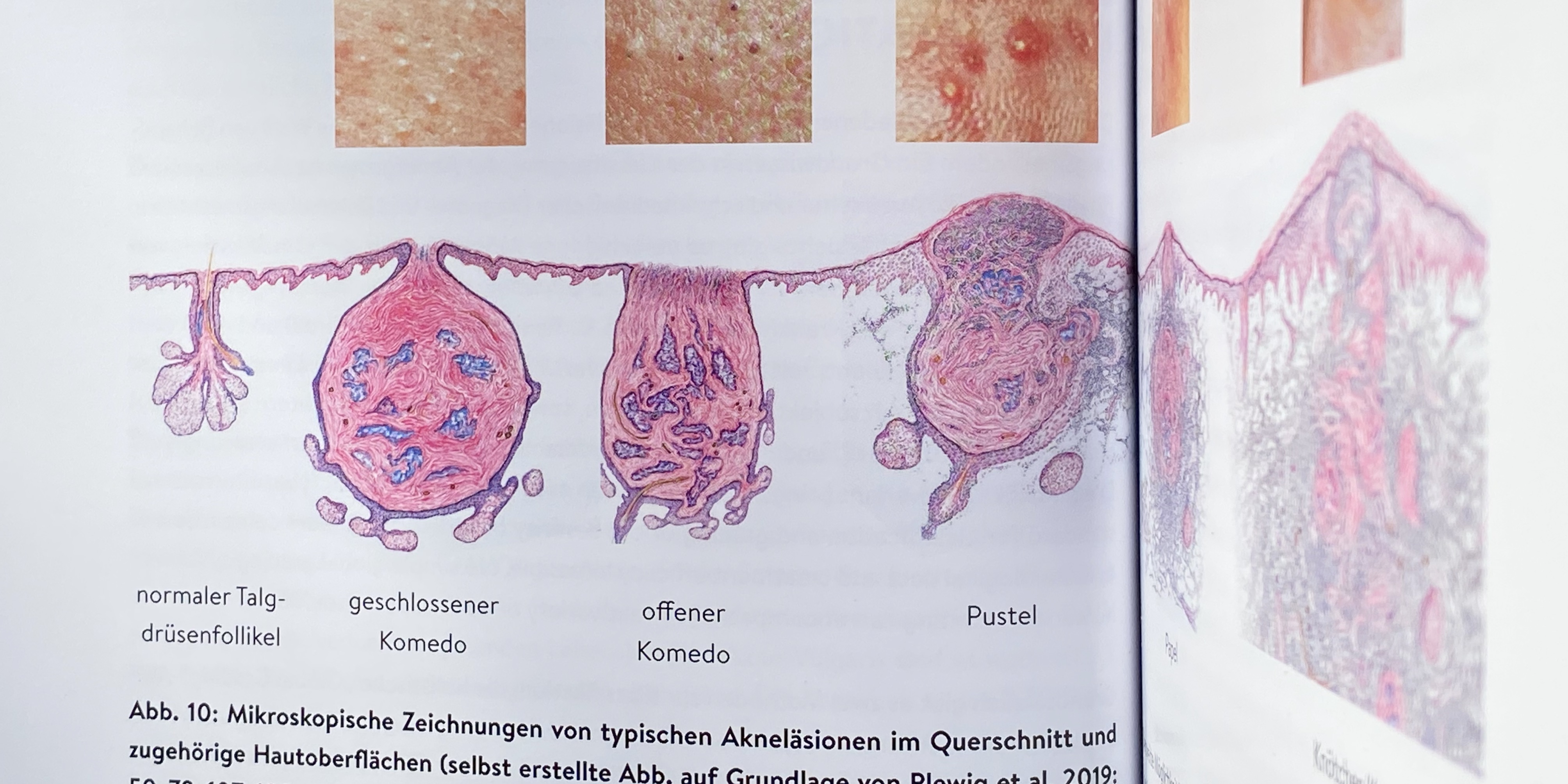
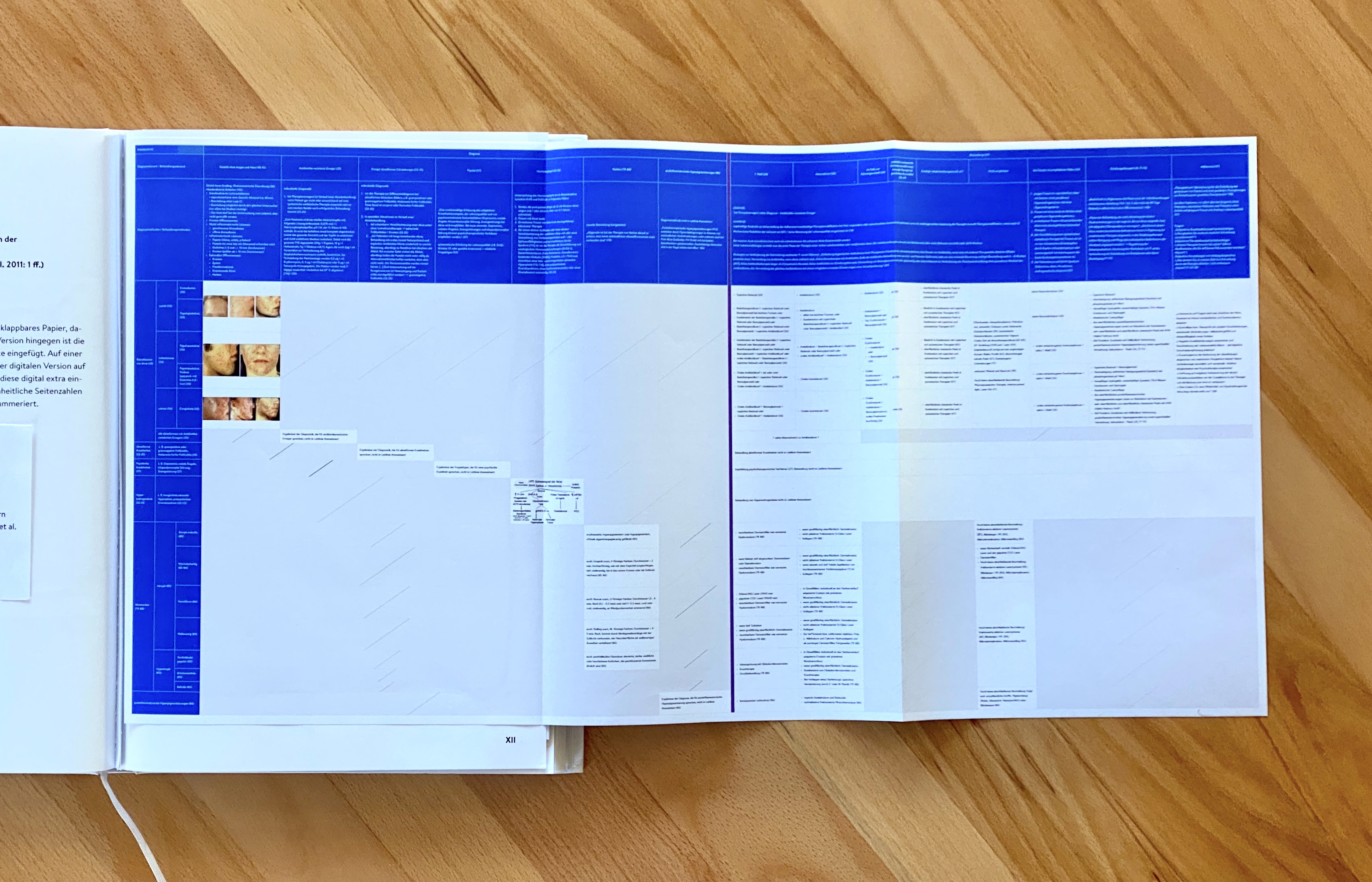
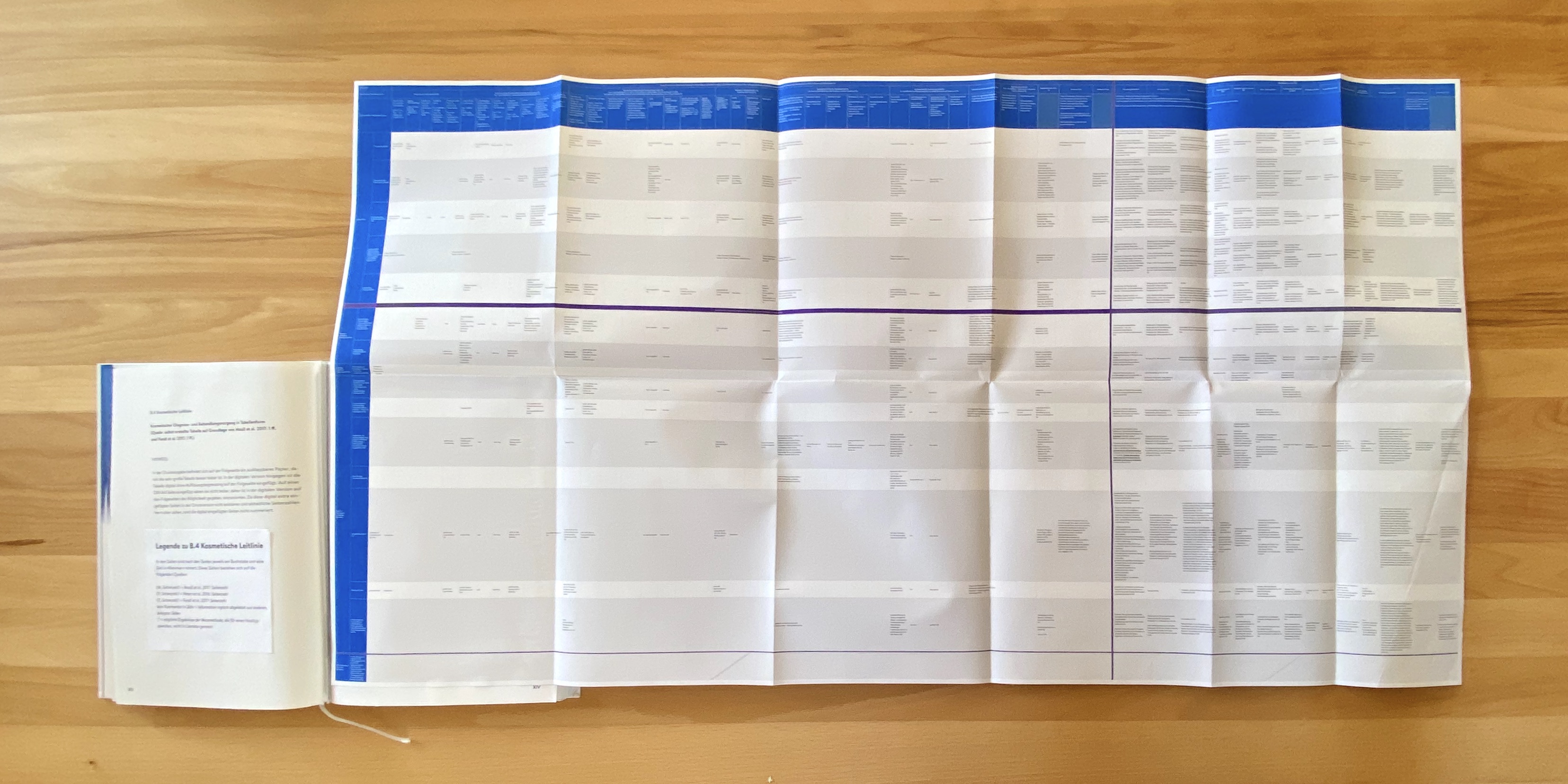
(Analysis of various acne treatment guidelines)
My courses during my master's degree:


DATA-DRIVEN PRODUCT MANAGEMENT
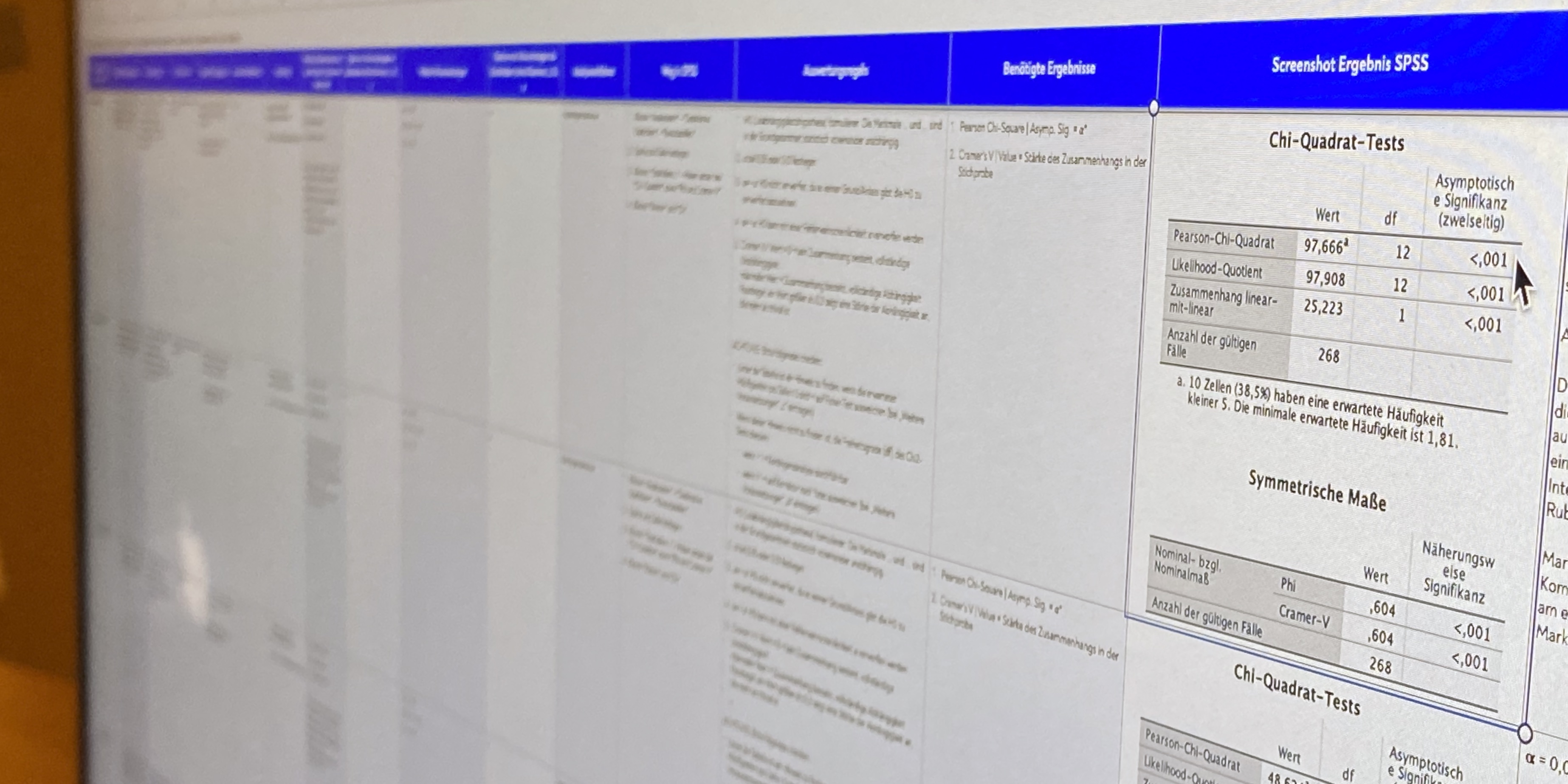
While finishing my master's degree, I worked at t3n – a company producing content and creating platforms for the digital economy. I focused on increasing internal productivity and on statistical research (using SPSS) in order to make data-driven product decisions.
3 x
increased evaluation speed of website traffic through an excel automation
75 %
decreased time spent on quantitative research projects by creating an automated dynamic spreadsheet
5 → 1
identified opportunity to merge 5 tools into 1 project management tool to increase internal productivity
Other Tasks:
- defined 3 target groups through cluster analysis a. o.
- explored underserved needs of one target group through qualitative research
- Introduced the lean product development method for further utilization of the research results
- produced social media trailer, designed & hosted a statistics and SPSS training session, developed landing pages, did reportings, worked with Epics

















 (Analysis of various acne treatment guidelines)
